What I Learned Painting Zorn’s Martha Dana With a Limited Watercolor Palette
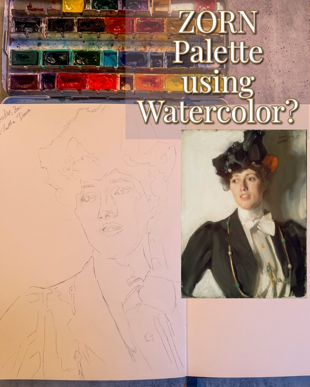
I recently painted a study of Anders Zorn’s Martha Dana using a very limited palette:
Yellow Ochre
Cadmium Red Light
Ivory Black
White gouache
The idea was simple: take the famous “Zorn palette” and see how far I could push it in watercolor.
What I expected was a straightforward limited-palette exercise.
What I got instead was a reminder that a palette doesn’t behave the same way across different mediums.
The first surprise: the painting doesn’t actually look strictly limited
Before I started, I knew the simplified Zorn palette was usually described as yellow ochre, a warm red, ivory black, and white.
But once I really started looking at Martha Dana, I noticed something fairly obvious that I probably should have studied more carefully beforehand:
there are passages in the painting that don’t feel easy to explain with those four colors alone.
In particular, some of the greenish notes felt too distinct.
I can’t confirm exactly what pigment Zorn used in those passages, so I don’t want to claim it was definitely Viridian. But visually, there are accents that felt much greener than anything I could comfortably mix from Yellow Ochre and Ivory Black alone.
That became one of the interesting parts of the exercise.
Rather than asking, “How do I copy this color exactly?” I had to ask:
How close can I get while staying inside the limitation?
And actually, Yellow Ochre mixed with Ivory Black can create some surprisingly convincing olive and green-gray mixtures.
Not every green needs a green paint.
Ivory Black became much more than “black”
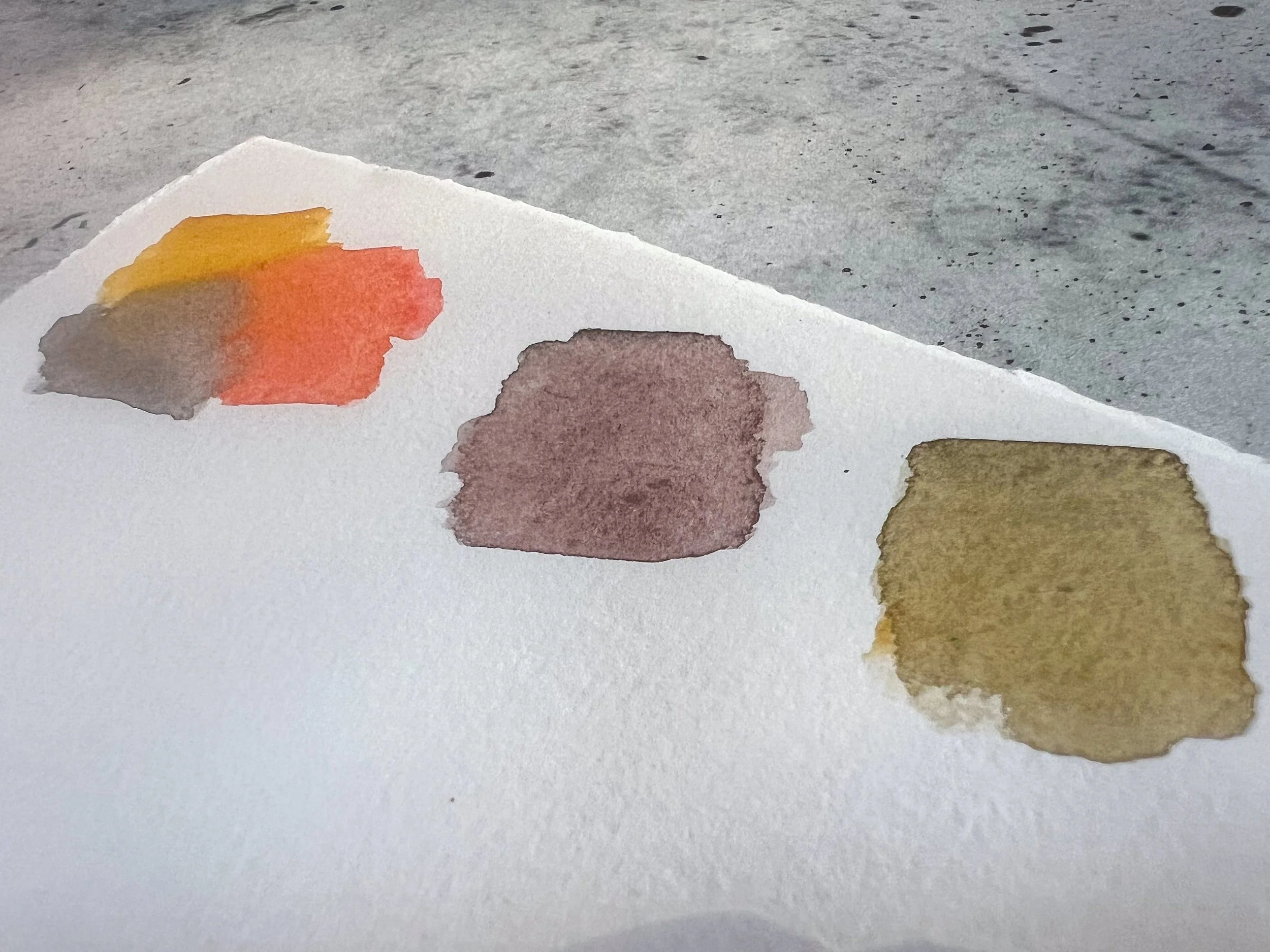
This was probably my favorite part of the study.
Once Ivory Black started mixing with Yellow Ochre and Cadmium Red Light, it stopped behaving like a simple darkening color.
With Yellow Ochre, it gave me muted greenish grays.
With the red, it created surprisingly cool neutrals.
With all three, I could move between warm browns, gray-violets, olive tones, and soft flesh shadows.
That’s really where the palette became interesting.
The limitation forced me to think less about naming colors and more about temperature.
Is this passage warmer?
Cooler?
More neutral?
Does it need more red, more ochre, or more black?
That way of thinking was much more useful than trying to mix an exact “skin color.”
The biggest limitation was actually the white
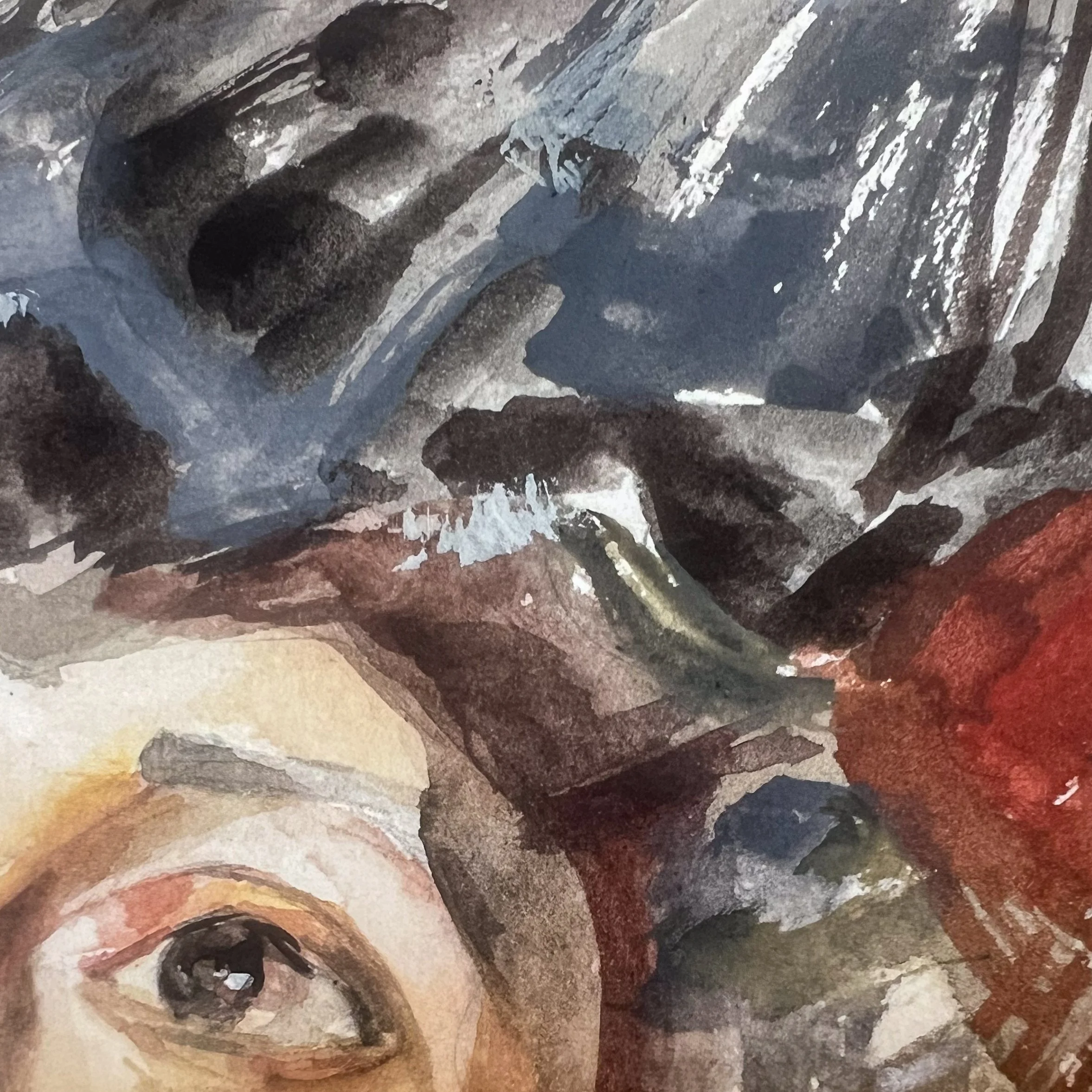
This is where watercolor changed the whole experiment.
In oil painting, white is a mixing color.
You can mix it directly into black, ochre, or red and create pale opaque grays, pinks, creams, and blue-gray neutrals.
In transparent watercolor, the paper usually acts as the white.
And those two things are not really equivalent.
Leaving white paper exposed gives you brightness, but it doesn’t give you the same softened, opaque color mixture that comes from physically mixing white paint into a darker pigment.
That became especially obvious in the cooler gray passages.
There were areas where Ivory Black diluted with water simply did not give me the same effect as black mixed with white.
It stayed transparent.
It felt different.
And the color temperature didn’t quite behave the same way.
So toward the end, I introduced a small amount of Schmincke calligraphy white gouache and mixed it directly with watercolor.
That changed everything.
Ivory Black mixed with opaque white created the pale cool gray I had been struggling to reach.
Yellow Ochre mixed with white gave me softer creamy passages.
And once I started using those mixtures selectively, the painting began to make much more sense.
Watercolor + gouache was closer to the original logic
That was probably my biggest takeaway.
If I tried this again, I wouldn’t treat the white gouache as an emergency fix.
I would include it from the beginning.
For this particular kind of master study, watercolor plus gouache actually makes more sense to me than strict transparent watercolor.
Not because gouache is “better,” but because the original palette depends on white functioning as an actual pigment.
The gouache allowed me to recreate that relationship much more convincingly.
I still left plenty of untouched paper.
But having the option to mix an opaque white into the other pigments gave me a much wider range.
The painting also reminded me how useful limitations can be
There were plenty of moments where I wanted another color.
A blue would have made certain shadows easier.
A green would have made those accents easier.
A cooler red could have solved another problem.
But not having those colors forced me to look harder.
Instead of automatically reaching for a new pigment, I had to ask what I could do with the colors already on my palette.
And sometimes the answer surprised me.
The painting ended up feeling much more colorful than the palette actually was.
That’s probably the most valuable part of this exercise.
A limited palette doesn’t necessarily create a limited-looking painting.
If anything, it can make you more sensitive to small changes in temperature and value.
What I’d do differently next time
I would spend more time studying the original painting before beginning.
I would also make a proper mixing chart beforehand, especially:
Yellow Ochre + Ivory Black
Cadmium Red Light + Ivory Black
Yellow Ochre + Cadmium Red Light
all three together
each mixture with white gouache
That would have saved me a lot of searching while painting.
And if I were doing another Zorn-inspired watercolor study, I would absolutely keep white gouache on the palette from the beginning.
Not as a correction.
As one of the actual colors.
Final thought
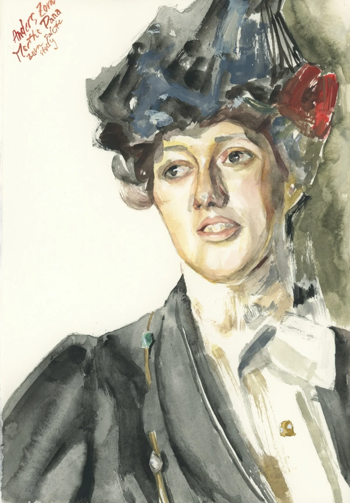
This study wasn’t really about reproducing Zorn’s painting perfectly.
It became more about understanding what happens when you take the logic of an oil-painting palette and translate it into watercolor.
Some things translated beautifully.
Some things didn’t.
And the most interesting part was figuring out why.
For me, the biggest discovery was this:
paper white and painted white are not interchangeable.
And once I stopped treating them as if they were, the whole palette started making more sense.
That alone made the study worth doing.
Materials I Used
For this study, I used:
Some of the links below are affiliate links, which means I may earn a small commission at no extra cost to you.
I painted this Martha Dana study live using Yellow Ochre, Cadmium Red Light, Ivory Black, and white gouache. If you want to see the full process — including the mixing problems, adjustments, and where the gouache started helping — you can watch the full LIVE below.