What I Brought Home From Santa Barbara as an Artist
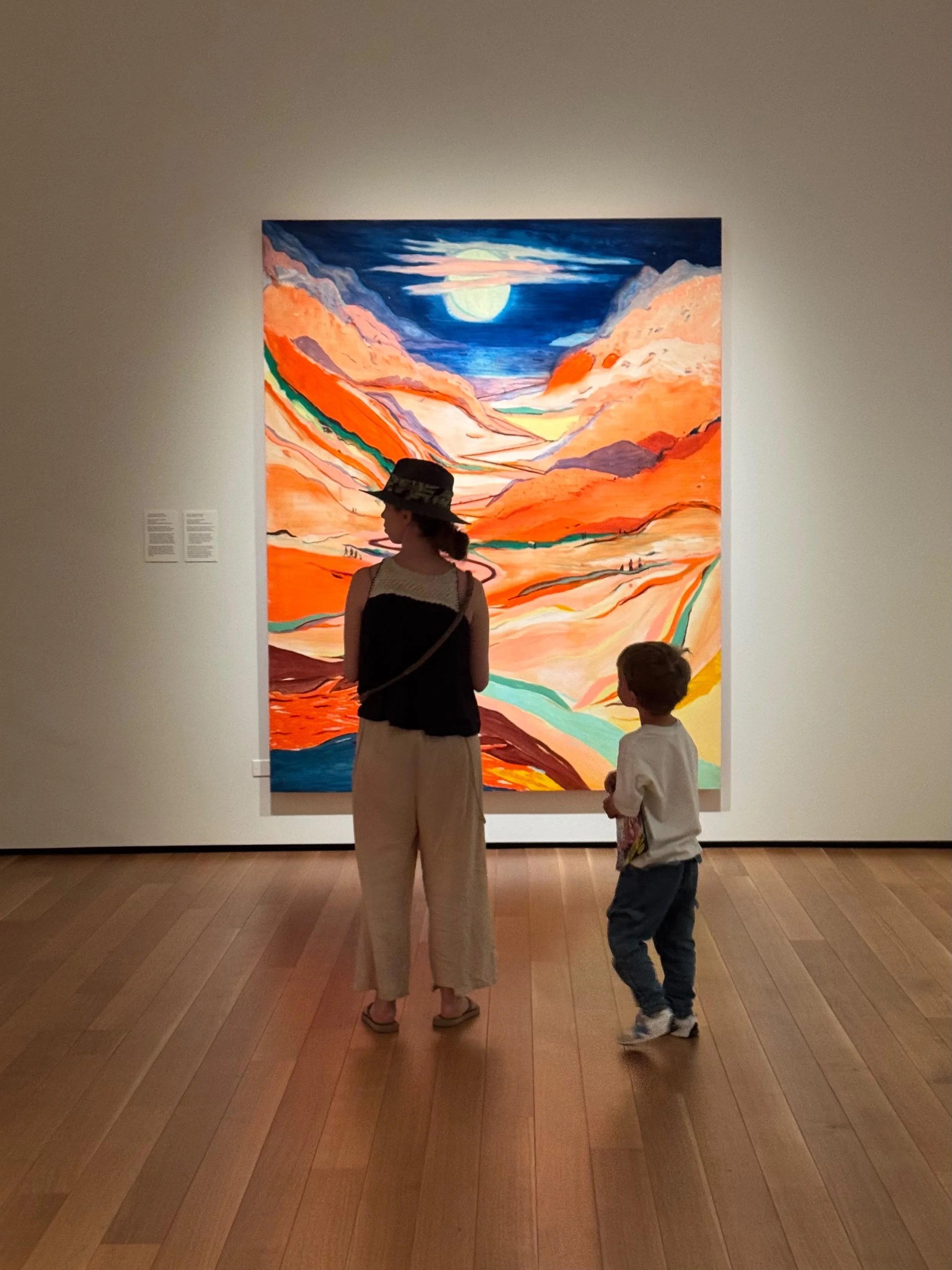
I went to Santa Barbara expecting a few days away. I came home with a rather long list of things I wanted to try in the studio.
That is probably my favorite thing about seeing art in person. I don't necessarily leave wanting to paint like the artists I've seen. Usually, it's much smaller things that stay with me.
A material I didn't expect. A surface treatment. The way somebody left part of a painting unfinished. A color relationship I can't stop thinking about.
Sometimes it's simply, wait... could I try that?
Here are six things that followed me home.
1. Rafael Coronel: How little can a portrait need?
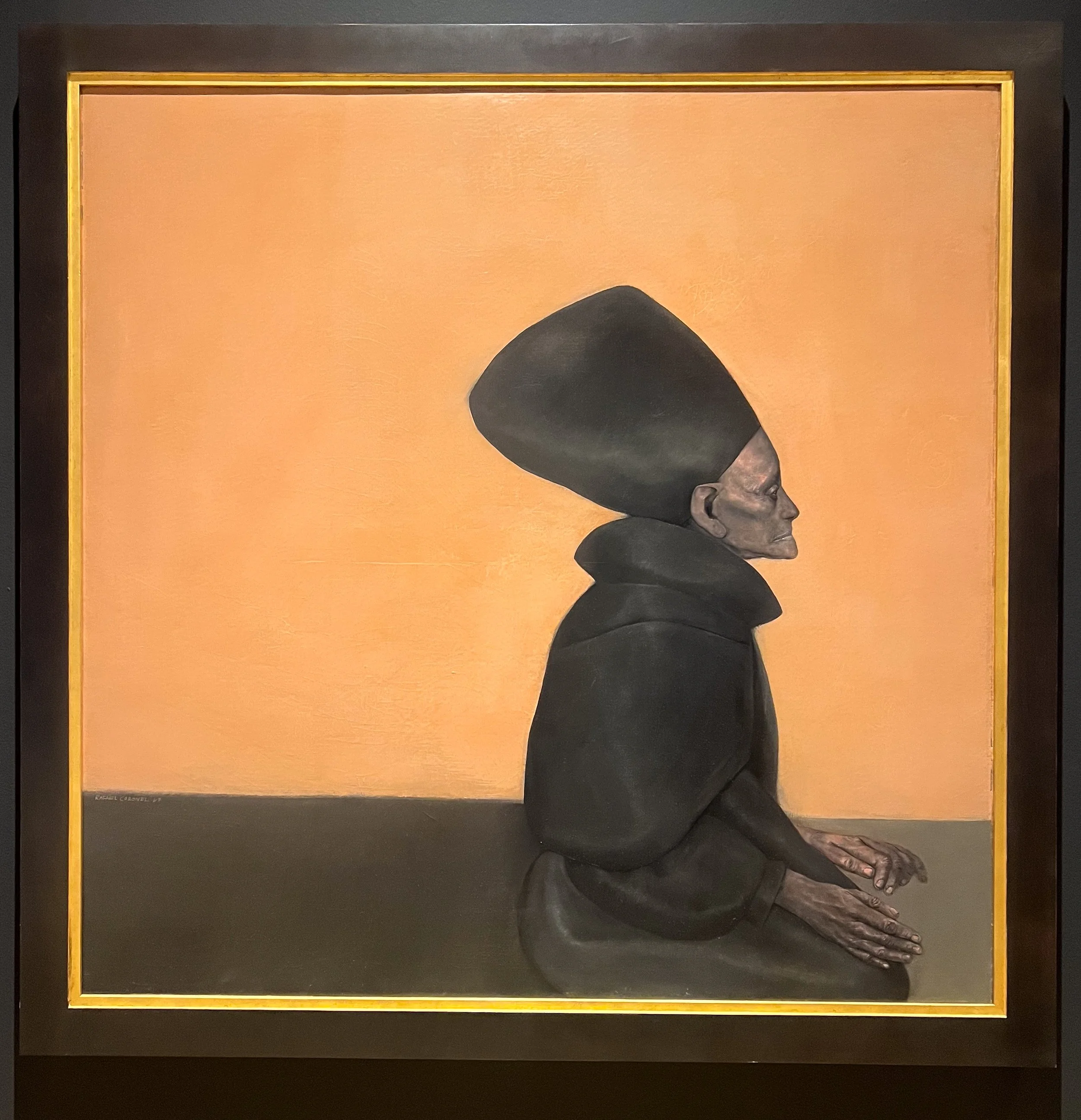
My favorite work at the Santa Barbara Museum of Art was Rafael Coronel's Rosa en el pasillo from 1967.
It was also probably one of the simplest.
The first thing I noticed was the silhouette. This enormous black shape dominates the painting, with Rosa's profile emerging from it against this warm peach-colored background.
Then I got closer.
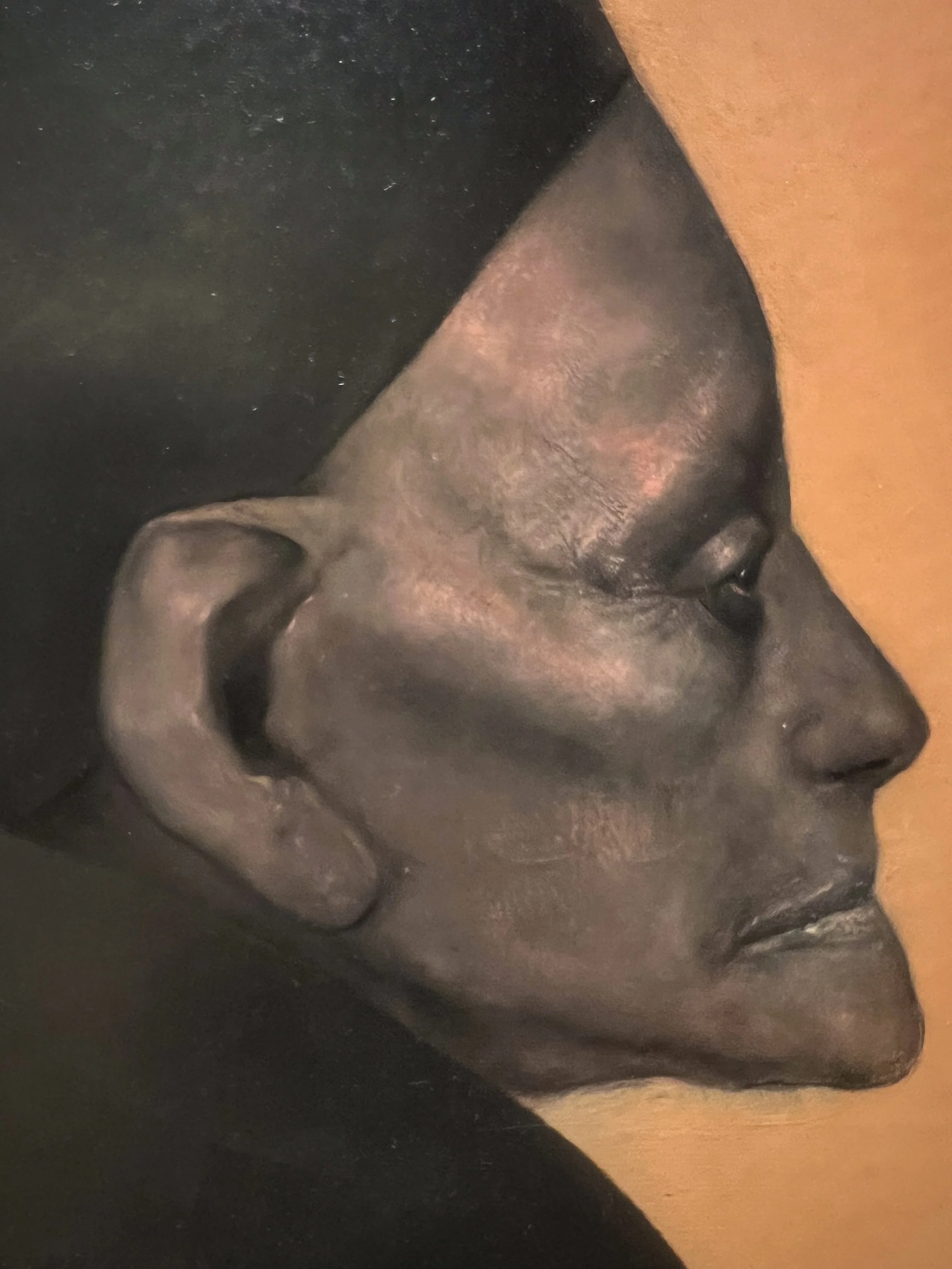
Her face is incredibly dark. There isn't a huge range of color describing it, yet it feels completely dimensional. Some of the light across her skin seems almost related to the color of the background itself.
And then there are her hands.
The pose and gesture are beautiful. I found myself looking at the way Coronel describes them through value, but also through line. There is something almost drawn about parts of them.
The museum describes Rosa as Coronel's grandmother and the painting as a meditation on time and quiet solitude. Her profile deliberately recalls historical figures, including Nefertiti, which made sense to me because I had immediately felt something classical and almost timeless about her.
She feels mysterious without the painting having to explain very much at all.
TAKE HOME → restraint.
I've spent so much time recently thinking about adding materials, marks and textures. This painting reminded me to ask the opposite question too:
How much can I take away and still make a portrait feel alive?
2. Daniel Crews-Chubb: What if I build the surface?
Then I encountered almost the complete opposite.
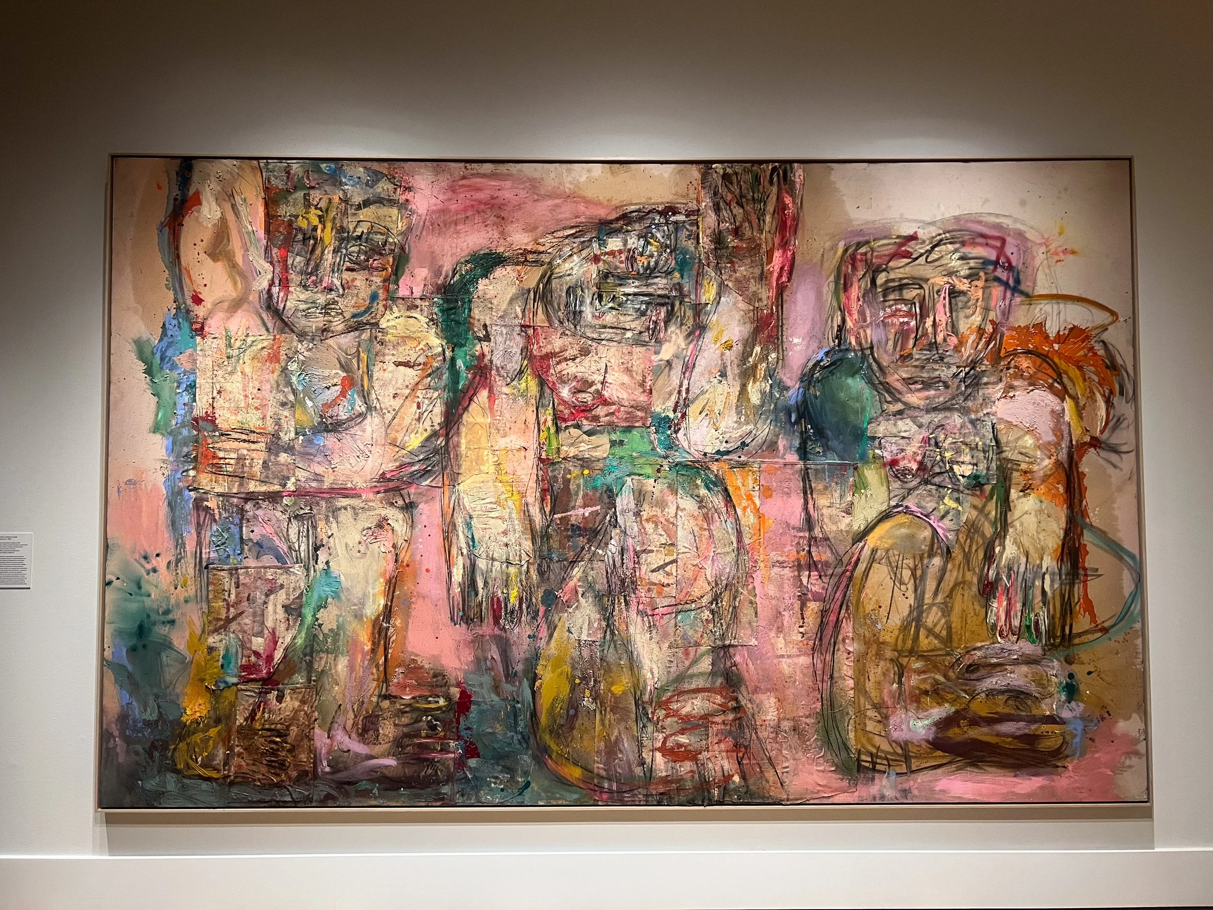
Daniel Crews-Chubb's Three Immortals (pink) from 2023 is enormous, messy, layered and incredibly physical.
From a distance, I was first attracted to the figures and the palette. There is something ancient about them, but the marks also reminded me of graffiti. It doesn't feel like an artist trying to recreate an ancient image. It feels very contemporary.
Then I walked closer and realized the painting wasn't simply painted.
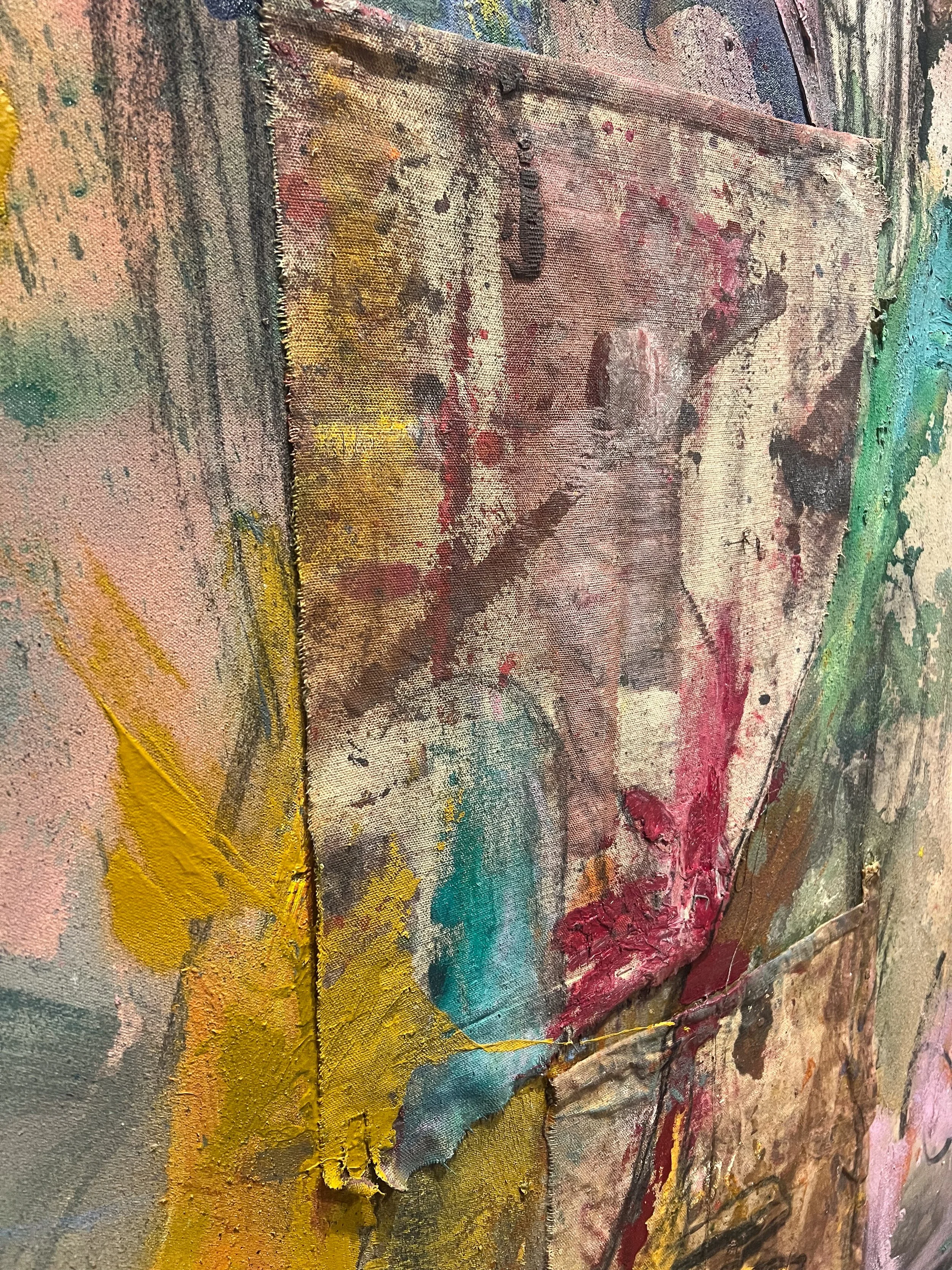
Crews-Chubb uses oil, acrylic, spray paint, charcoal, ink, sand and collaged fabrics on canvas. Pieces of fabric sit over the main canvas. There are raw edges, overlapping surfaces, thick areas of paint and drawing moving across everything.
The closer I looked, the more the surface itself became part of the subject.
That particularly interested me because I've recently been experimenting beyond watercolor with acrylic, charcoal and oil. I've been thinking about what happens when different media collide, but I have still largely been thinking of the support as something I paint on.
This made me wonder what happens if I start physically building it too.
TAKE HOME → don't just paint on the surface. Build it.
3. Mimi Lauter: Paper doesn't have to feel delicate
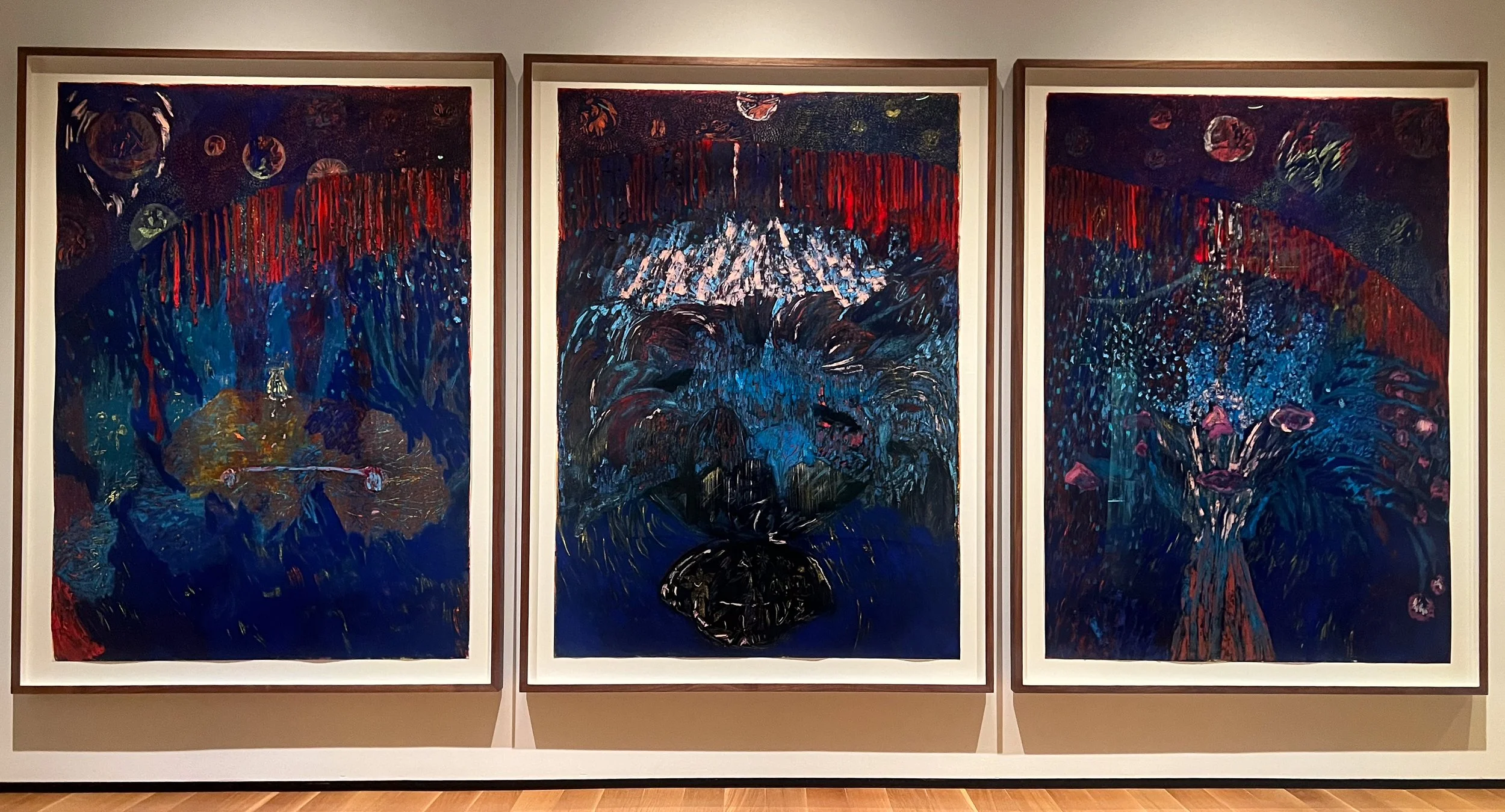
Mimi Lauter's Colossale Allargando Con Spirito stopped me because of its scale and color.
These works were huge and dark, with these incredibly rich reds, blues and almost glowing marks.
Naturally, I walked right up to them.
That was when I noticed the surface and started wondering what kind of paint I was looking at.
It wasn't paint.
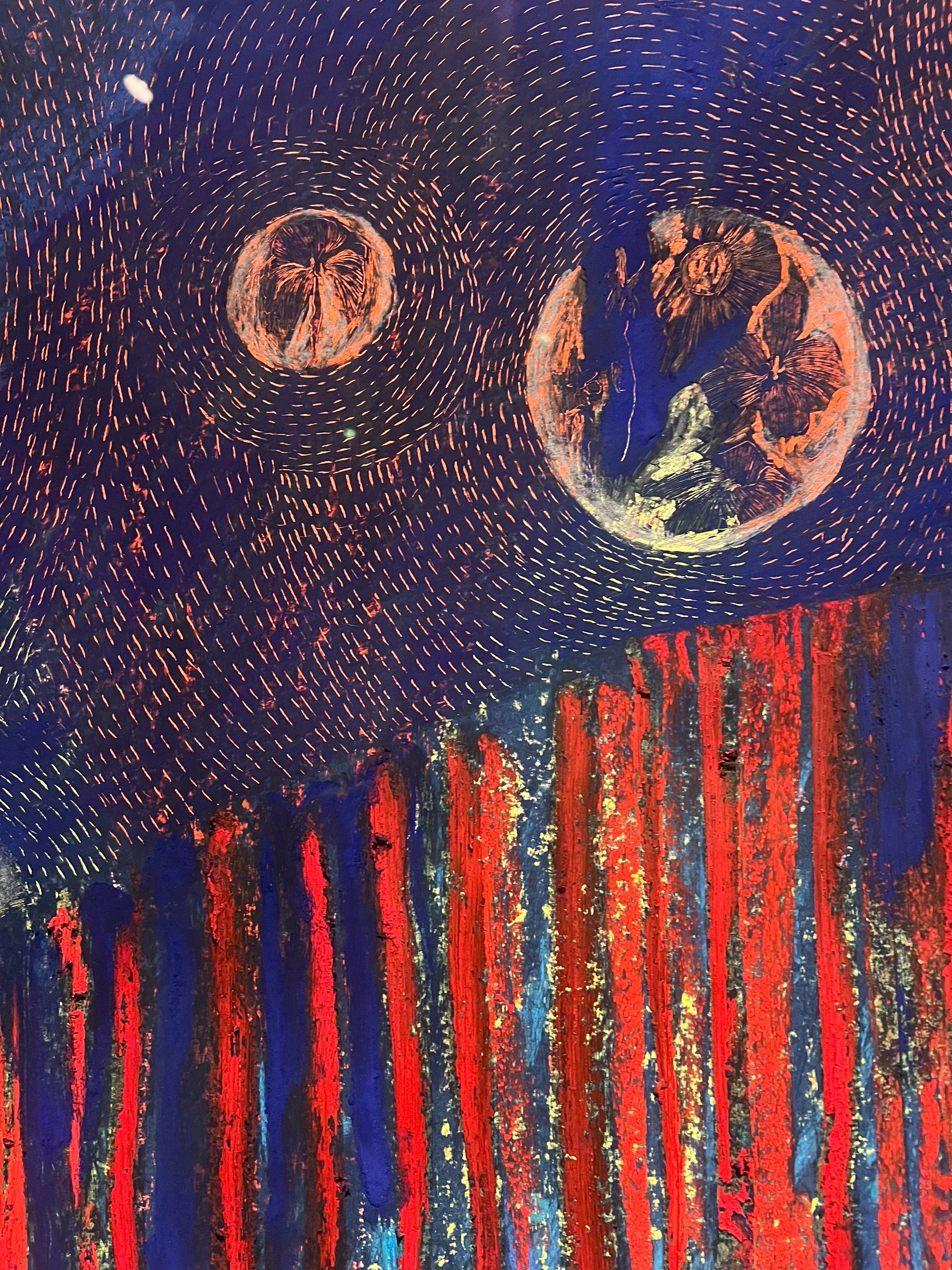
The work is made with oil pastel and soft pastel on paper.
That surprised me.
I'm primarily a watercolor artist, so paper is already central to the way I work. But seeing paper used at this scale, with this amount of saturation and physical presence, made me think about it differently.
You could even see that the paper wasn't behaving like a perfectly rigid surface. Rather than diminishing the work, that physicality somehow became part of it.
It also gave me another surprise: this might have been one of the first times I've looked at artwork on paper behind glazing and thought the presentation actually added something to the experience.
TAKE HOME → stop assuming paper has to feel delicate.
4. Damien Hirst: The detail I almost missed
This one wasn't even at the museum.
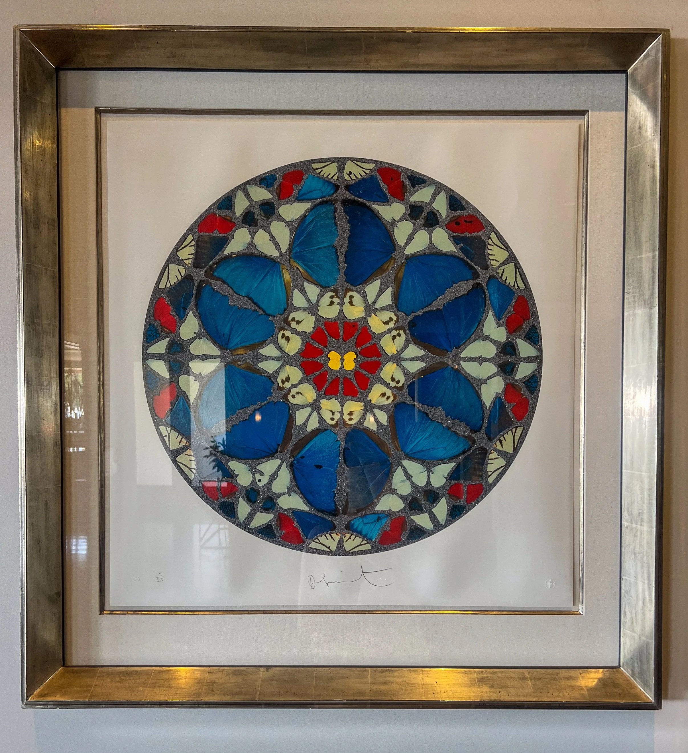
There was an artwork at our hotel that kept catching my attention. I started photographing it and looking more closely before realizing it was a Damien Hirst work.
But strangely, the butterflies weren't ultimately the part I photographed most closely.
It was the embossing.
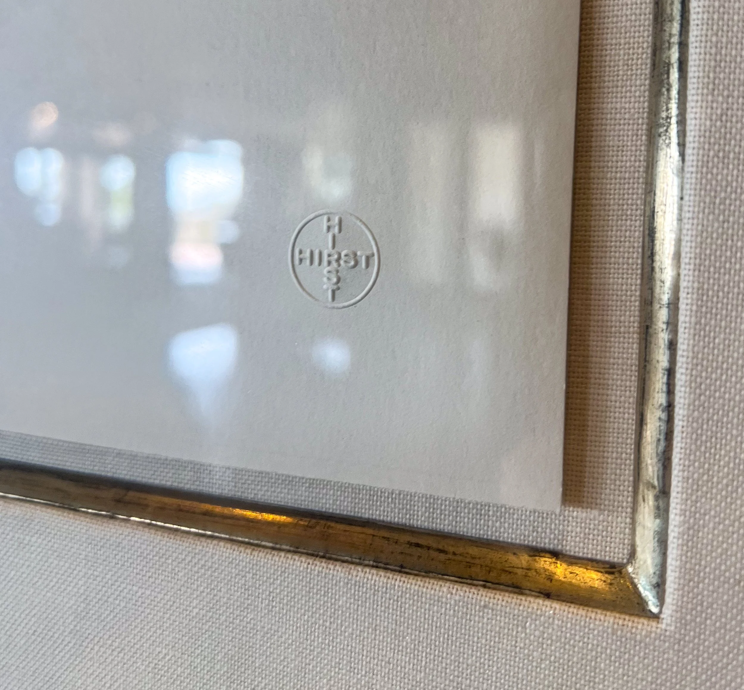
There were these tiny embossed marks pressed into the paper, including the Hirst mark and edition information.
Such a small thing.
But I loved what it did.
I've been thinking about how I sign, stamp and present my own work, and suddenly I could imagine embossing becoming part of that. Something that doesn't compete with the painting but is discovered when somebody gets close enough.
It's an idea I genuinely want to experiment with.
TAKE HOME → sometimes the smallest finishing detail changes how an artwork feels.
5. Mary Grace: Maybe it's finally time to paint the pearls
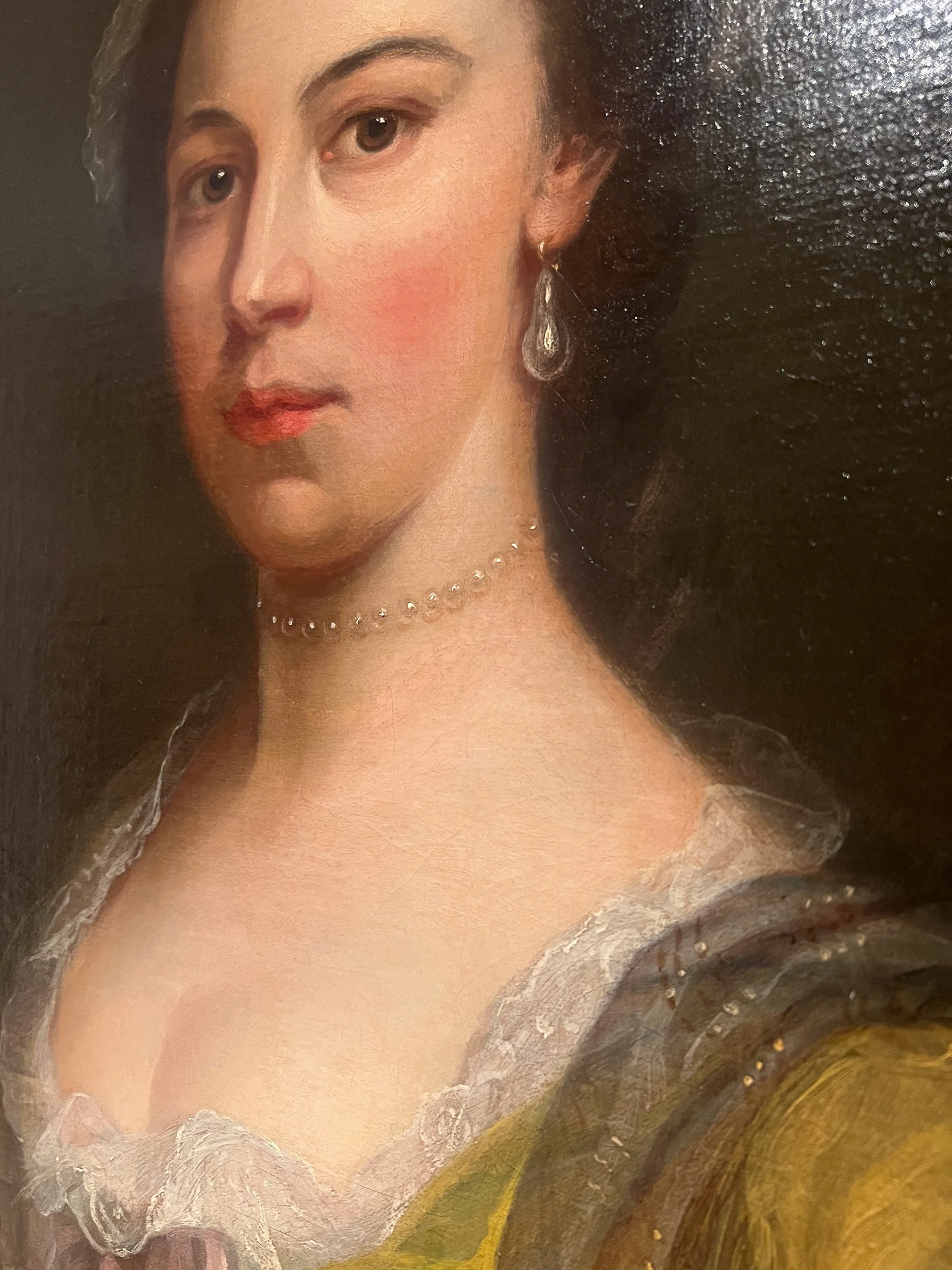
Mary Grace's Self Portrait, painted around the 1760s, didn't give me an entirely new idea.
Instead, it reminded me of one that has been following me around for years.
Pearls.
I've noticed pearls repeatedly in historical portraiture. I love the way painters describe them with so little, often just tiny changes of value and a few points of light.
In Grace's self portrait, the necklace is remarkably understated. From a distance it almost disappears. Up close, those tiny points suddenly become individual pearls.
I've wanted to make a portrait in which pearls really matter for a long time.
And now that I've started finding my way back into oils, seeing them again made me think that perhaps I should stop filing that idea away for later.
TAKE HOME → maybe it's finally time to paint the pearls.
6. Robert Frederick Blum: Let some of it stay unfinished
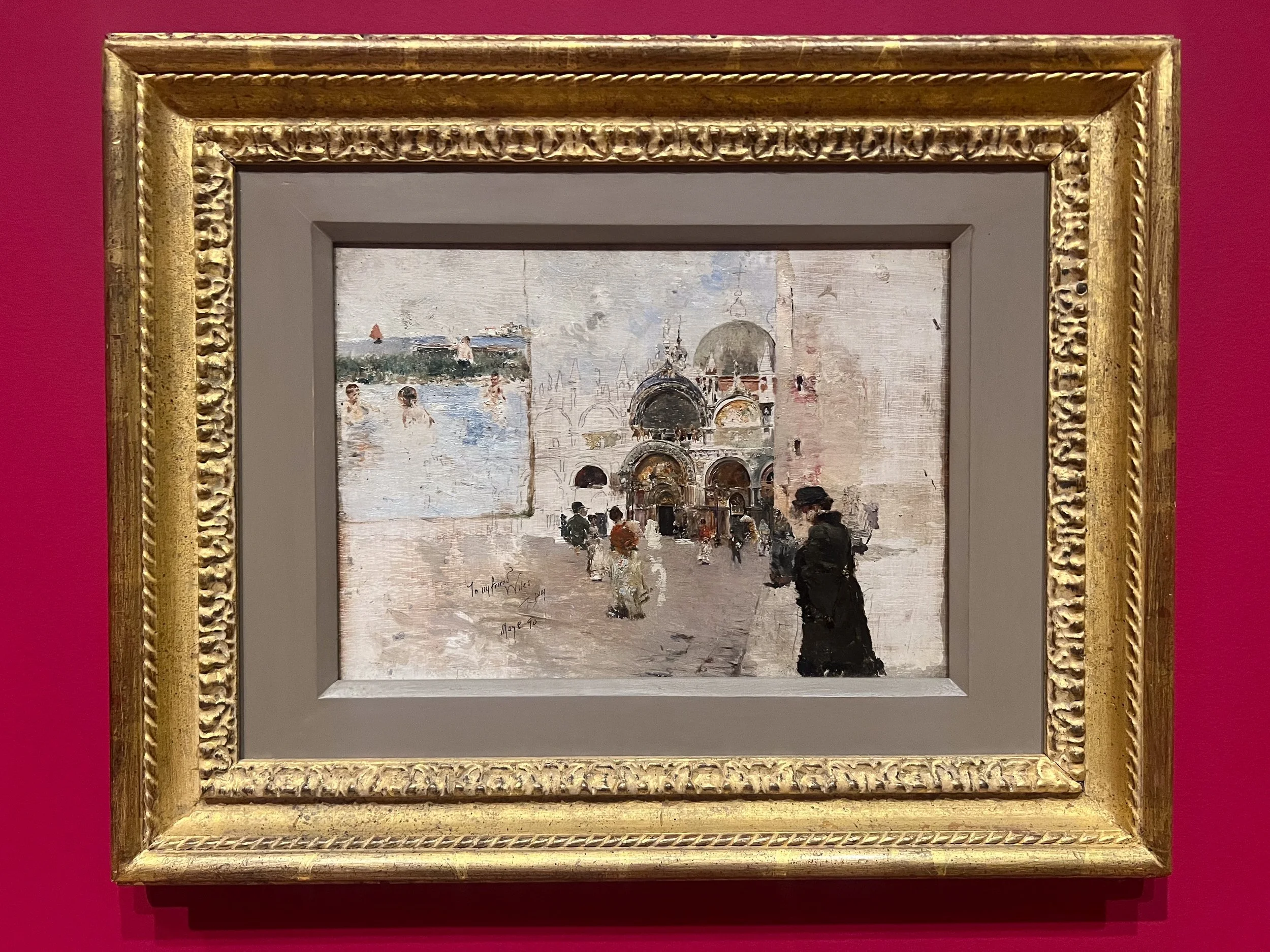
Finally, there was Robert Frederick Blum's Sketches of Venice, The Lido from 1890.
I loved this little painting.
Or perhaps I loved that it still felt like a sketch.
There are areas of exposed canvas. You can see the grain of the support. Architectural lines appear without ever becoming fully painted buildings. Some figures are barely more than a few marks.
There are little pieces of information everywhere.
And somehow, when you stand back, your eye puts them together.
That is something I keep coming back to in my own work. I love paintings where you can still see evidence of the process. Where a drip can remain a drip. Where the paper or canvas gets to show. Where one area can be highly resolved while another is barely suggested.
Blum's painting reminded me that the individual pieces don't have to feel finished for the whole painting to feel resolved.
TAKE HOME → leave enough room for the viewer's eye to finish something too.
What actually makes it back into the studio?
Looking back at everything I photographed in Santa Barbara, I realized how contradictory my notes are.
One painting made me want to use less.
Another made me want to start attaching fabric to canvases.
I want to try embossing.
I want to push what I can do on paper.
I want to paint pearls.
And apparently I also want to stop finishing everything.
But maybe that's the useful part of looking at other artists' work.
I'm not trying to collect a set of rules.
I'm collecting possibilities.
The interesting part comes next, when I return to my own studio and find out which of these ideas actually survives the journey home and becomes part of the way I paint.