
Testing Rare Japanese Watercolors: What Surprised Me Most
In my last post, I shared why I brought these art supplies back from Japan.
This time, I tested them.
Not casually — but inside my actual studio workflow. On hot press. On cold press. In layered washes. In side-by-side comparisons against brands I already trust.
Some tools earned a place immediately.
One disappointed me.
A few surprised me in ways I didn’t expect.
If you’d like to watch the full testing process, you can see it here:
👉 https://youtu.be/8r_75heKCg4
Below is what stood out.
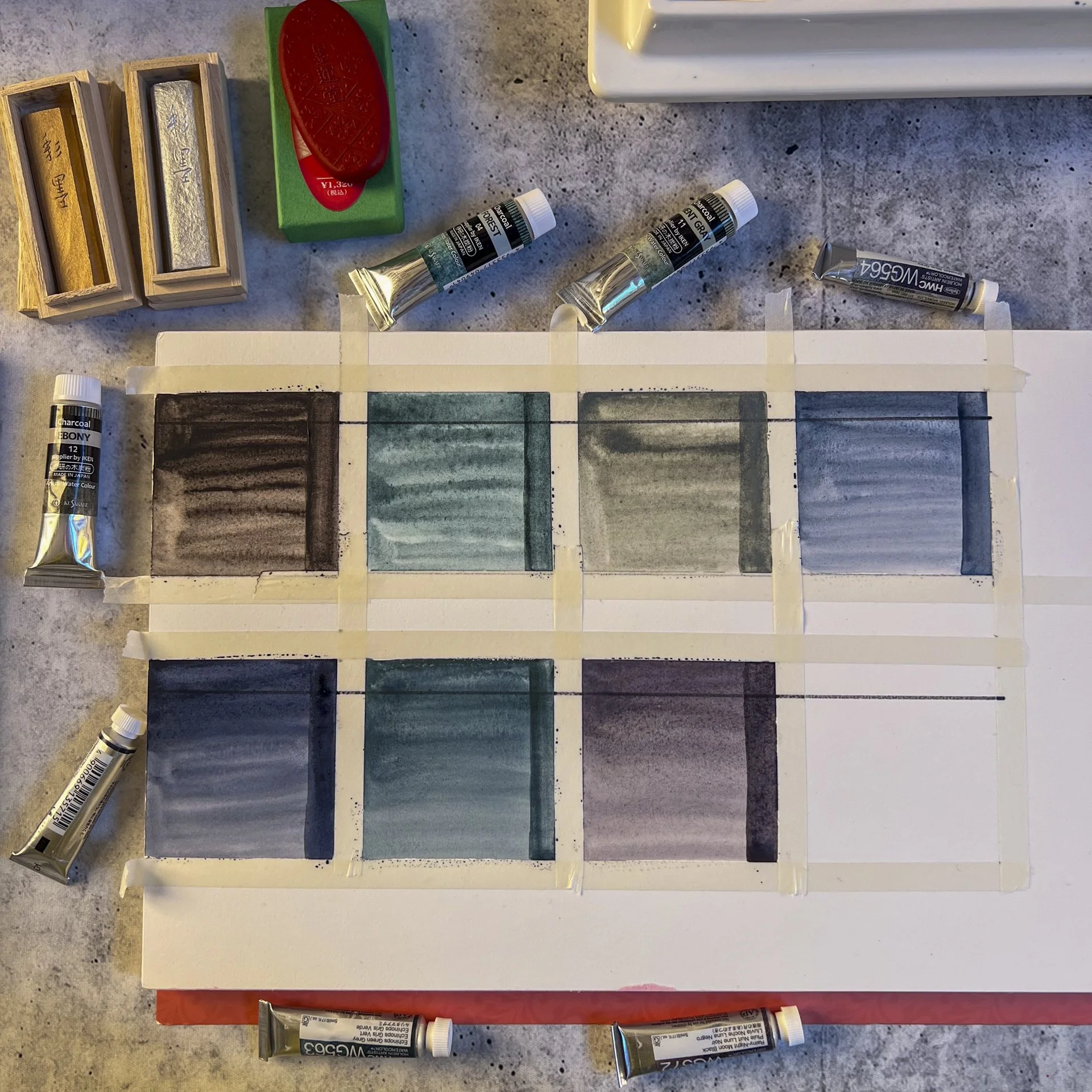
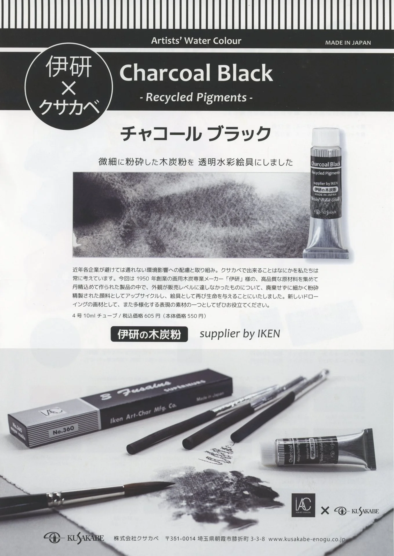
Kusakabe Charcoal Series
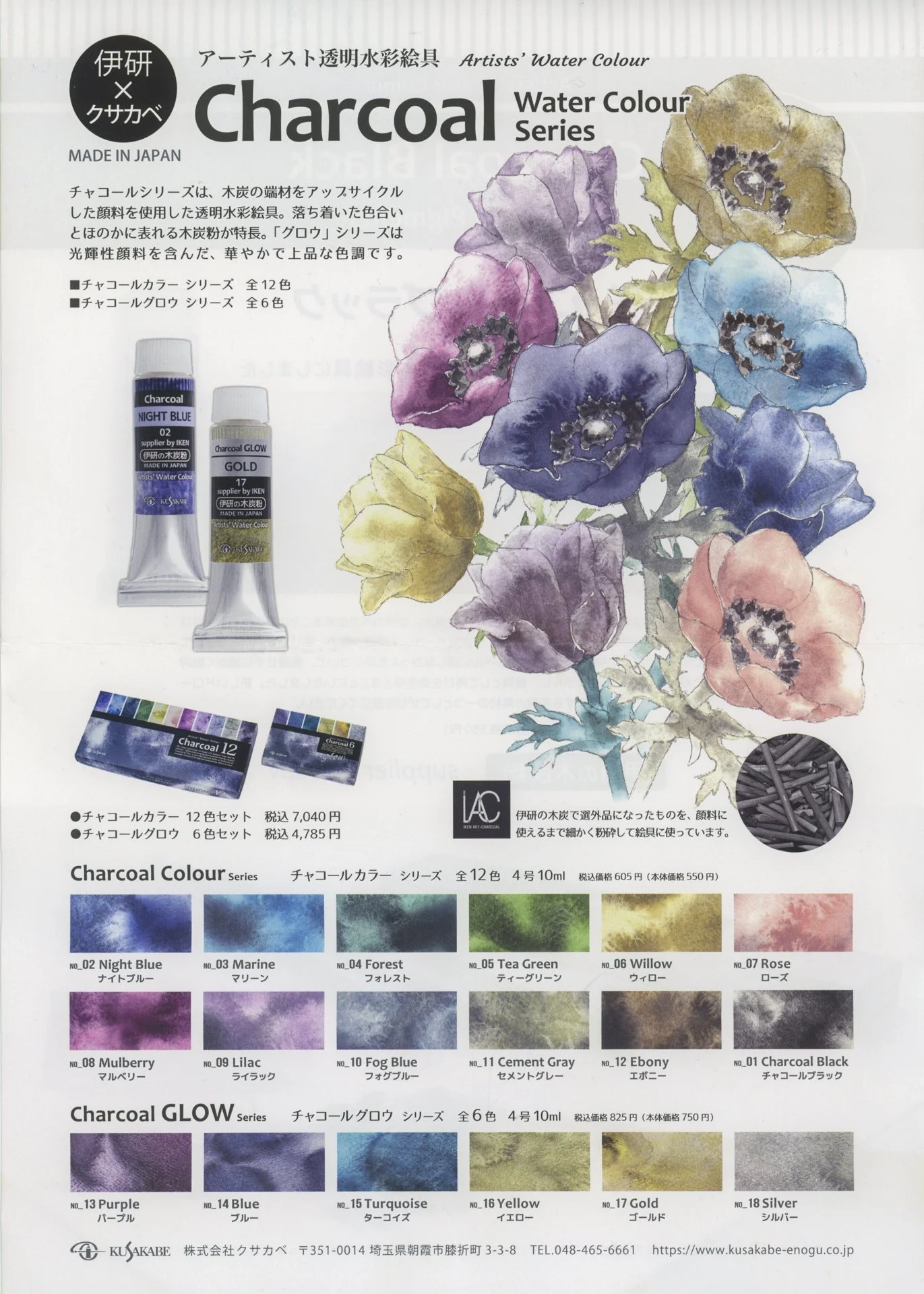
These were the paints I was most curious about — especially Ebony.
❌ Ebony (Charcoal)
I expected to love it.
Instead, it became my least favorite of the set.
On hot press, it felt muddy. On cold press, it behaved slightly better — but still lacked the depth and structure I was hoping for in a charcoal black.
It’s not unusable.
But it didn’t give me that velvety, dimensional shadow I want for portrait work.
This was the biggest surprise.
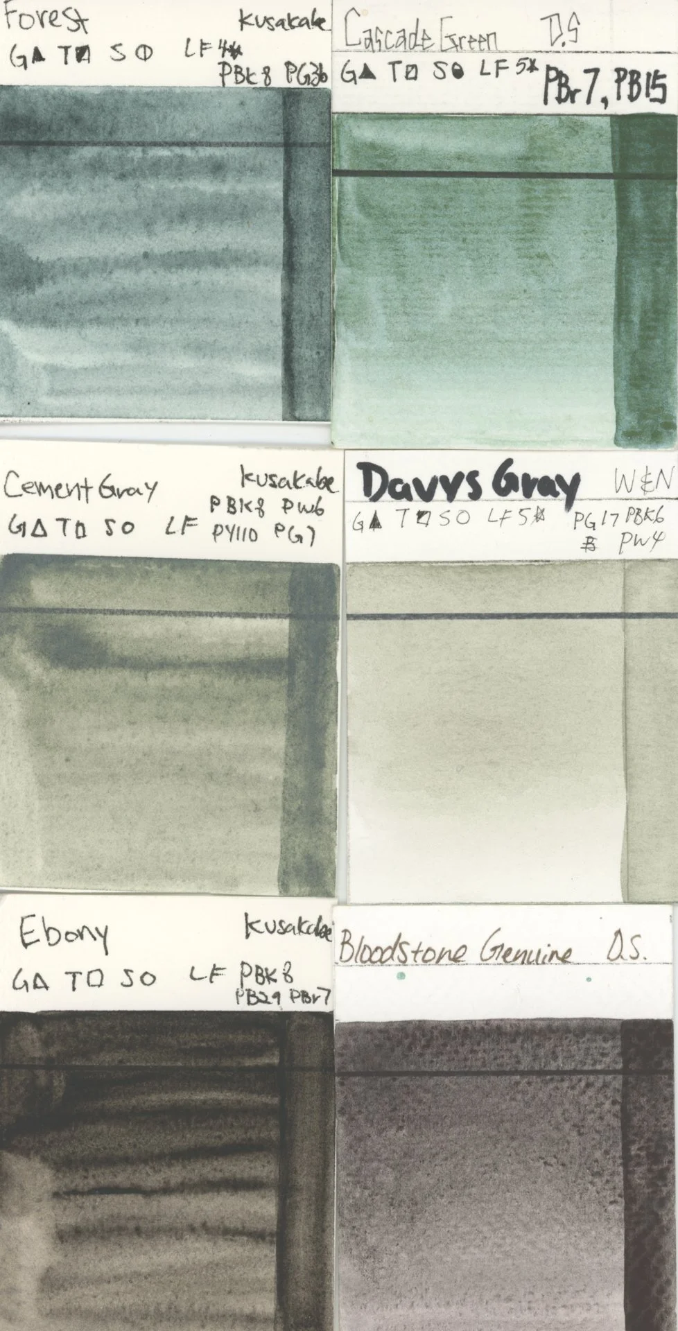
✅ Cement Gray (Unexpected Favorite)
Cement Gray completely won me over.
It has a subtle green undertone mixed with an ashy depth that feels architectural without being flat. It reminds me loosely of Winsor & Newton’s Davy’s Gray — but richer and more complex.
It’s opaque, slightly mineral, and incredibly usable.
I actually used it immediately in a loose abstract test piece.
This one earns a permanent spot in my palette.
🌲 Forest
Forest sits somewhere between Daniel Smith’s Cascade Green and a muted cobalt green.
On cold press, it blooms beautifully.
On hot press, it’s more controlled.
It has that mineral granulation that gives surface interest without overwhelming the wash.
This one feels promising for atmospheric shadow in portrait backgrounds.
Holbein “Granulating” Series
Holbein rarely disappoints — and this set was no exception.
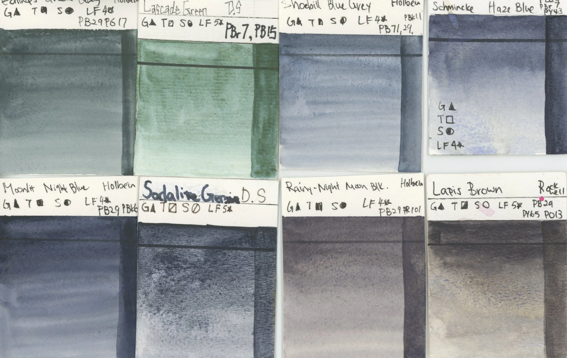
Shoebill Blue Gray
A cooler, quieter gray-blue. Less yellow than expected from the pigment listing.
Subtle and elegant.
Moonlit Night Blue
This one immediately reminded me of Daniel Smith’s Sodalite Genuine from the PrimaTek line — that deep, night-sky mineral feel.
Gorgeous on both papers.
Echinops Green Gray
Strong cobalt presence (PG17).
Textural. Slightly opaque.
Feels very usable in layered portrait shadows.
Rainy Night Moon Black
This may replace Rockwell’s Lapis Brown in my studio — especially since my Lapis Brown shifted in direct sunlight over time.
Rainy Night Moon Black has depth without that orange shift.
That matters for archival reasons.
Colored Sumi (Saiboku)
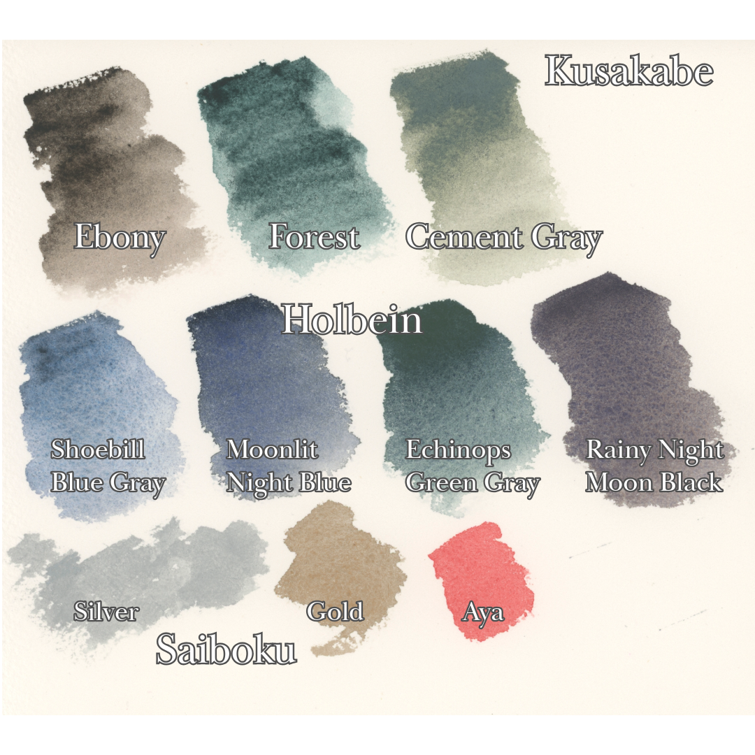
The silver surprised me.
It was stronger and more luminous than expected — almost blinding under light.
The gold was subtler than I anticipated. That may have been user error (first-time grinding + wrong wipe-down method).
The Aya red was stunning — vibrant, staining, and powerful.
These are inks, not traditional archival watercolors, so I will be testing lightfastness separately.
But aesthetically?
The red is absolutely entering my workflow.
The Massive Flat Brush
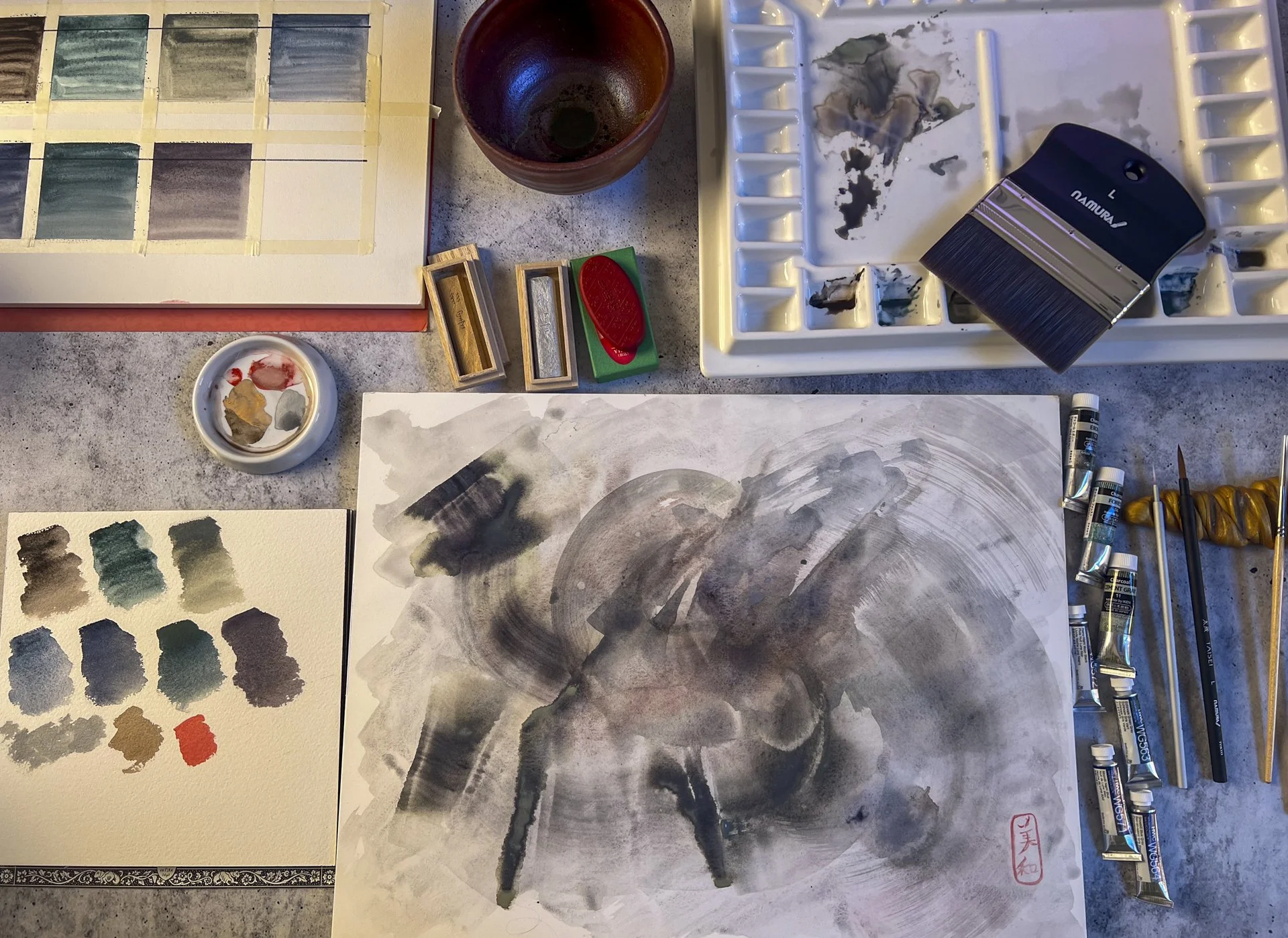
I did not expect this to be the most fun part of the test.
It flooded my desk.
It holds an enormous amount of water.
But the sweep — the immediacy — the ability to cover a surface in one decisive motion — completely changed my energy.
For my upcoming featured exhibition at Columbia City Gallery this April, I’ll be working at a larger scale.
This brush is coming with me.
Final Verdict
Keeping:
Cement Gray
Rainy Night Moon Black
Moonlit Night Blue
Aya Red (colored sumi)
The giant flat brush
Still Testing:
Forest
Shoebill Blue Gray
Silver Sumi (lightfastness)
Disappointed:
Ebony
The lesson?
The color you think you’ll love is not always the one that earns its place.
Sometimes the quiet gray becomes the anchor.
If you want to see the full swatching process and side-by-side comparisons, you can watch the complete testing video here:
👉 https://youtu.be/8r_75heKCg4
And if there’s one color you’d like me to put through a longer lightfast test, let me know.