
How I Choose Colors for a Travel Watercolor Palette (After 6 Years of Painting)
When I build a travel watercolor palette, I don’t begin with warm and cool primaries.
I begin with usage.
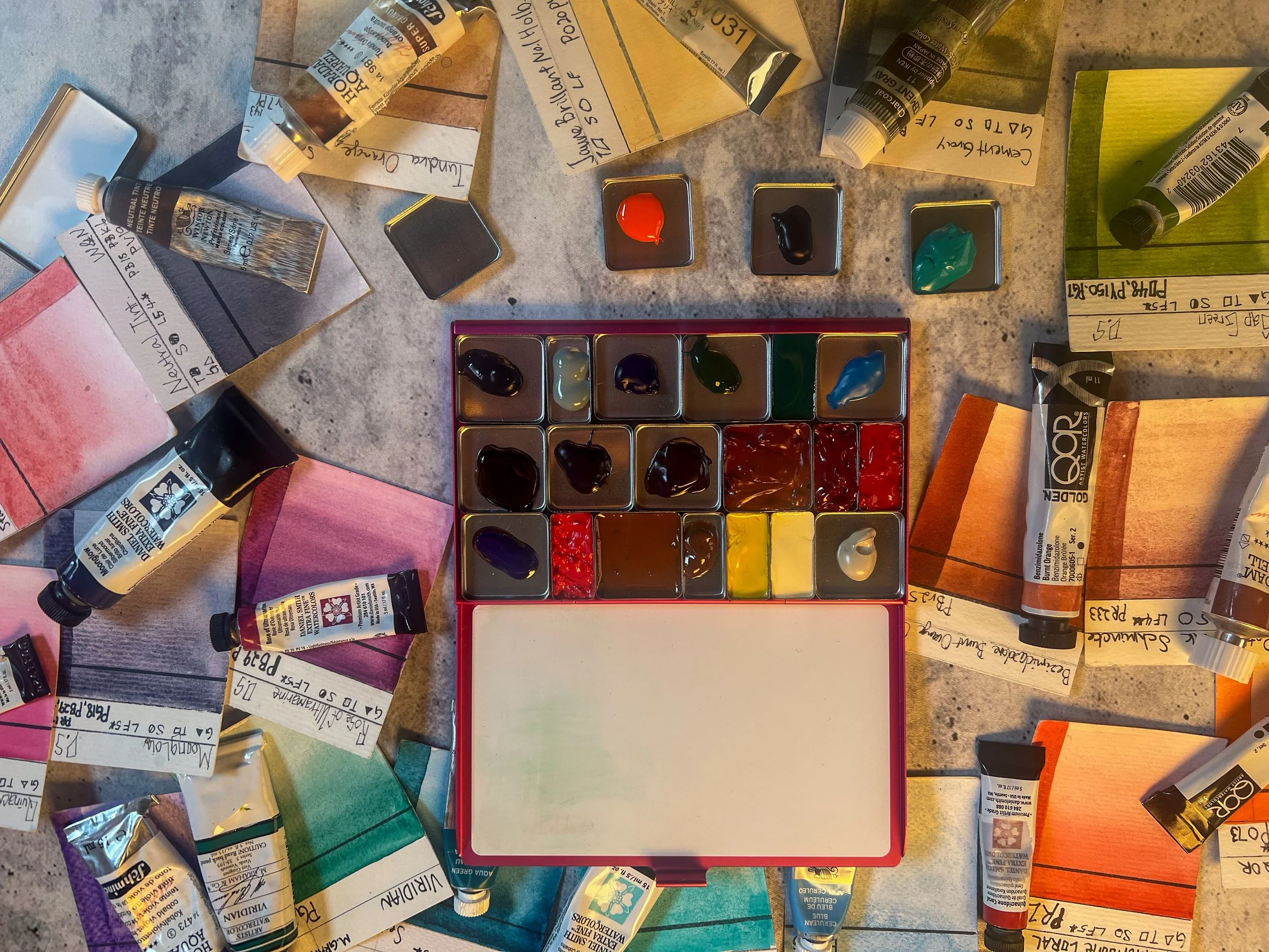
After six years of painting in watercolor, I already know what I reach for. The information is sitting inside my existing palettes — the wells carved deep, the tubes I refill repeatedly, the pigments that disappear faster than the rest.
That is my data.
Start With Evidence, Not Theory

If you’re just starting out, building a palette around warm and cool primaries makes sense. It gives you structure.
But after years of painting, theory isn’t the most honest starting point. Habit is.
I looked at:
My Portable Painter travel palette
My DIY tin palette
My studio palette
Which tubes I’ve refilled most often
Which pans have visible “holes” carved into them
Those worn wells tell the truth. If I’ve refilled a color multiple times, that color earns its place.
Only after identifying those workhorse pigments did I ask the secondary questions:
Do I have warm and cool versions of primaries?
Do I have browns and neutrals for portrait work?
Are there any functional gaps?
Theory came second. Reality came first.
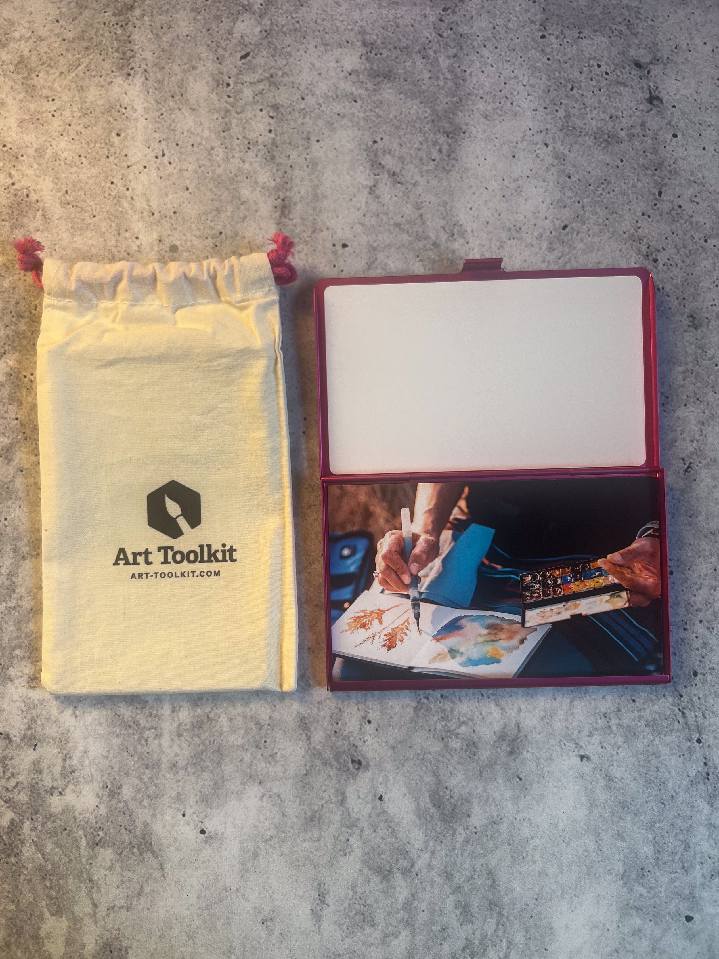
Conditioning the Folio Surface
The Folio palette instructions recommend conditioning the magnetic surface with a light coat of vegetable oil before placing pans inside.
I used a very small amount of coconut oil.
Coconut oil is plant-derived and works similarly in this context — the goal is simply to lightly condition and protect the surface, not saturate it. You want a thin film, wiped down thoroughly.
It’s a small step, but it helps maintain the finish over time.
Filling the Pans Properly (And What I Learned)
Filling pans sounds simple. It isn’t.
If you want your pans to dry flat and rewet evenly, here’s what worked best for me:
Fill the pan completely — don’t leave gaps.
Lightly mist the surface with water.
Tap the pan gently to help the paint settle.
Use a toothpick to level and mix.
Let it dry fully before closing the palette.
Some pigments cooperate beautifully.
Honey-based paints (like M. Graham) dried smooth and flat with very little effort.
Other pigments were far more stubborn. A rose pigment I used clumped and refused to settle evenly. It dried textured and uneven despite careful leveling.
That’s not necessarily bad — but it’s useful to know that pigment behavior varies. The binder and formulation matter.
You can’t force every paint to behave the same way.

Standard Pans vs Double Pans
This was an unexpected lesson.
I initially chose several double pans for colors I use frequently. It felt efficient — more paint, fewer refills.
But while filling them, I realized something:
That is a lot of paint.
If I’m mostly sketching in a small sketchbook, it will take a very long time to use that volume.
Double pans do something psychological — they force you to commit to fewer colors.
Standard pans allow more variety.
If you’re indecisive, double pans might help narrow your choices.
If you love variety, smaller pans might serve you better.
In hindsight, I might have chosen more standard pans for flexibility.
Removing the Mixing Well
The folio includes an optional mixing plate.
Initially, I assumed I would need it.
But once I held the palette in my hand and tested the mixing space directly on the lid, it felt sufficient — especially for the kind of controlled sketching I typically do while traveling.
So I removed the extra mixing plate for now.
I may add it back in certain situations, or even pair the folio with a magnetic support system if I need more space. But for now, less feels right.
Leaving One Pan Empty
I intentionally left one double pan empty.
I always want room to adjust.
A travel palette should not feel locked in forever. It should allow for seasonal shifts, new pigment discoveries, or project-specific swaps.
That empty space is flexibility.
The Labeling Problem
Modular palettes are wonderful — but they create a new challenge.
If colors can be moved around easily, a traditional swatch card becomes less useful.
I’m still deciding how to label this palette in a way that makes sense. Writing names on the back of pans may be one solution. A separate master list might be another.
If you use a modular palette, I’d love to know what system works for you.
Letting Go of a Color
At one point, I realized I didn’t have room for everything.
An aqua green I enjoy had to be reconsidered.
Travel palettes force you to let go of something.
That constraint isn’t a limitation — it’s clarity.
A smaller palette isn’t about having less. It’s about having only what you truly use.
What This Process Actually Taught Me
This wasn’t about creating a “perfect” palette.
It was about aligning my tools with my habits.
Your travel palette is not a theoretical exercise. It’s a compressed version of how you actually paint.
If you’re unsure what to include, look at your existing wells. Look at your refill patterns. Look at the tubes that are nearly empty.
The answer is already there.
Watch the Full Process
If you’d like to see the full testing, filling, and decision-making process in action, you can watch the full video here: