Opera Pink. Will It Fade? A Long-Term Window Test
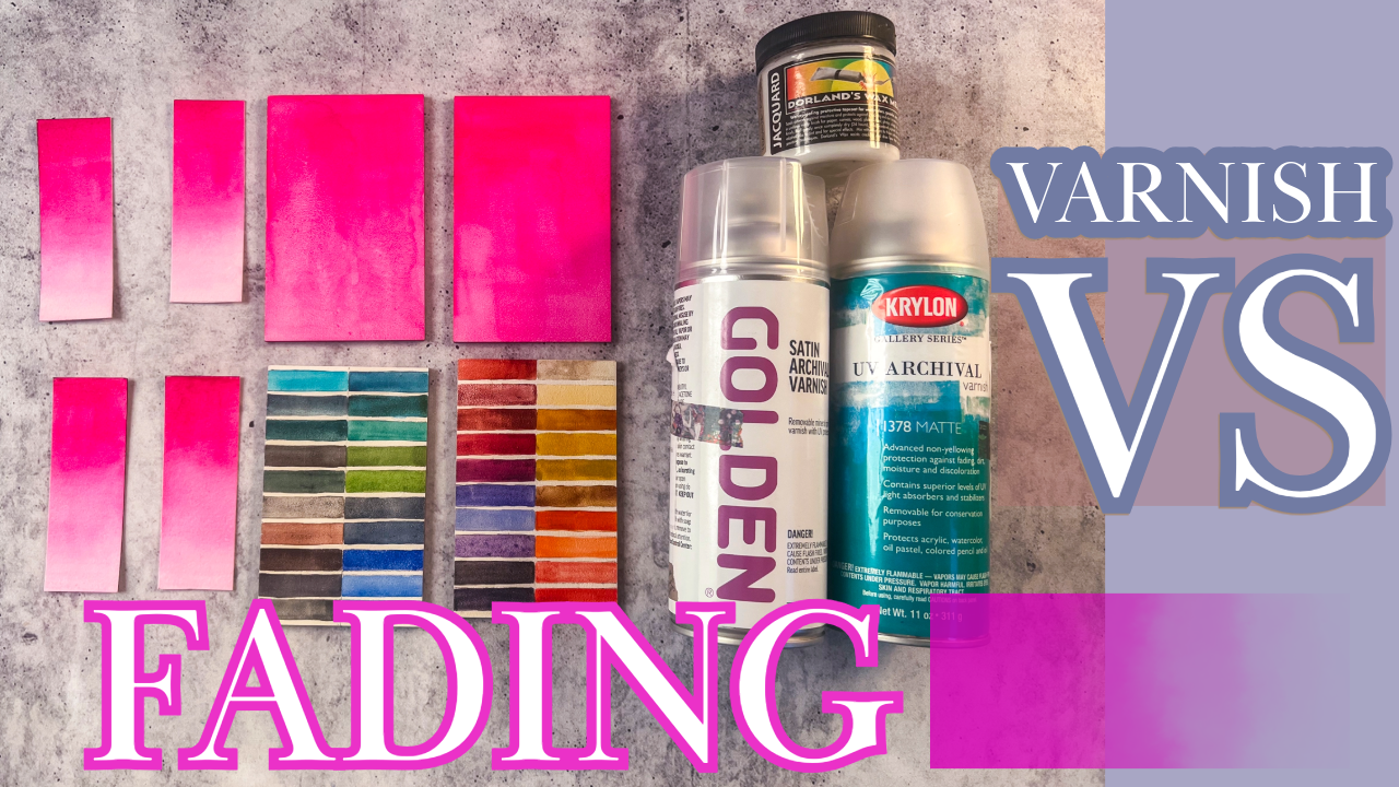
Opera Pink is one of the most beautiful colors in watercolor. It is also one of the most fragile.
Rather than debate whether varnish “saves” it, I decided to document what actually happens over time.
All swatches were painted on December 18, 2025.
Varnish was applied in early January.
The window exposure began on January 11, 2026.
The goal is not to rescue the pigment. The goal is clarity.
The Structure of the Test
Each surface includes four conditions:
Control
Golden spray varnish
Golden then Dorland’s wax
Dorland’s wax then Golden
An identical control set is stored in the dark. Everything was scanned before installation to establish a fixed baseline.
Same pigment. Same day. Same light. Only the surface and finish change.
Dark Control
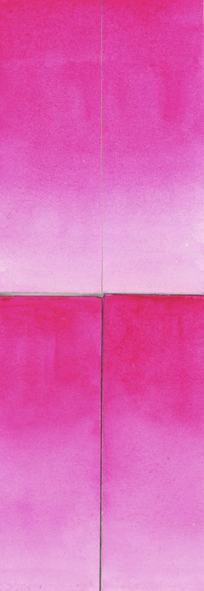
This set is stored flat with no light exposure.
It is the reference point.
Any visible shift in the window samples will be compared against this baseline.
The control matters more than the coatings.
Paper Test Matrix
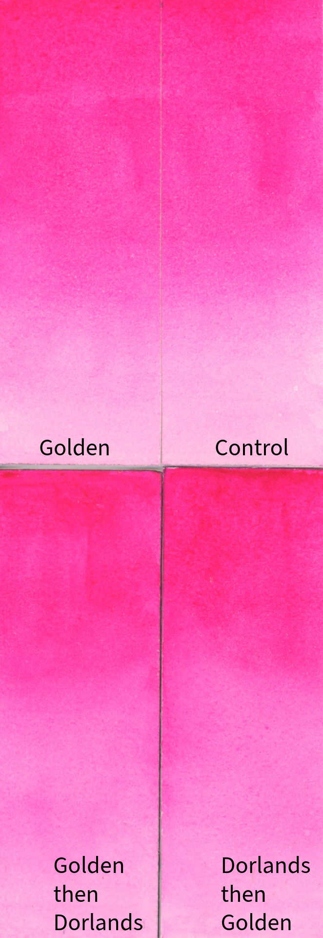
Paper test matrix. Same pigment. Different surface treatments.
On paper, I am observing four conditions:
Control
Golden spray
Golden then Dorland’s wax
Dorland’s wax then Golden
Paper is absorbent. Varnish sinks into fibers. Wax alters surface reflectivity.
The layering tests are not recommendations. They are observations. Artists often ask whether wax should go over varnish or under it. Rather than argue theory, I am documenting what happens in real conditions.
Aquabord Comparison
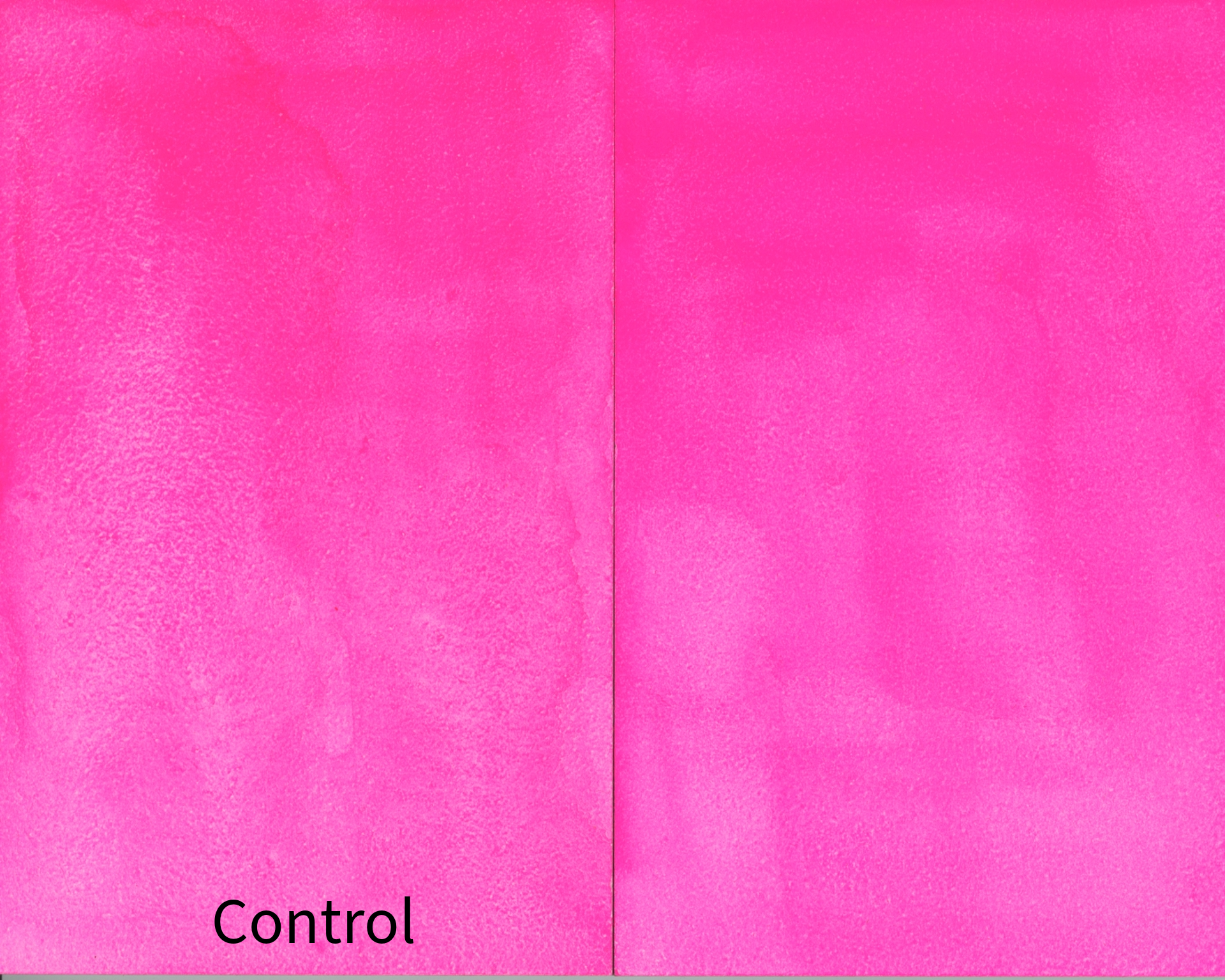
Aquabord comparison. Absorbent paper versus sealed surface.
Aquabord behaves differently from paper.
It is less absorbent. Varnish sits more on the surface rather than being drawn into fibers. That makes film formation more visible and, in some cases, less forgiving.
Here I am watching for:
adhesion
surface haze
uneven gloss
visible fading
The difference between paper and panel is not about which is better. It is about how coatings behave.
What This Test Is Not
No coating can make a fugitive pigment lightfast.
Varnish may slow visible change. Wax may deepen saturation or alter surface reflection. But fading is still fading.
Museums do use microcrystalline wax for certain objects. They do not use wax on watercolor paper. On paper, wax penetrates fibers and complicates future conservation. Works on paper are protected externally with matting and UV-filtering glass.
This test exists because artists sometimes choose to work without glass. That choice requires clarity.
What I Am Watching Over Time
Over the coming months, I will compare the exposed swatches to the dark control and look for:
loss of saturation
color shift
uneven fading
film failure in layered samples
Updates will be shared once there is meaningful change to observe.
Time, not opinion, will decide.
Materials Used
Some links below are affiliate links, which means I may earn a small commission if you purchase through them at no extra cost to you. I only share materials I personally use and test in my studio.
Golden UV Archival Varnish → https://tinyurl.com/yxfy7tu4
Dorland’s Wax Medium → https://tinyurl.com/4zfd7vf4
Aquabord → https://tinyurl.com/34787dzz
Opera Pink used in this test → https://tinyurl.com/2xs7fjwt
Experiment Note
This is a real-world studio test rather than a controlled laboratory lightfastness test.
For the paper samples, I included both exposed and dark reference comparisons. For the Aquabord sample, I compared the varnished window exposure against a dark control, but I did not include an unvarnished Aquabord sample in the same window conditions.
Looking back, adding that extra exposed control would have made the comparison stronger. Future tests will include both a dark control and an exposed unprotected control for every surface.
Additional Palette Test on Aquabord
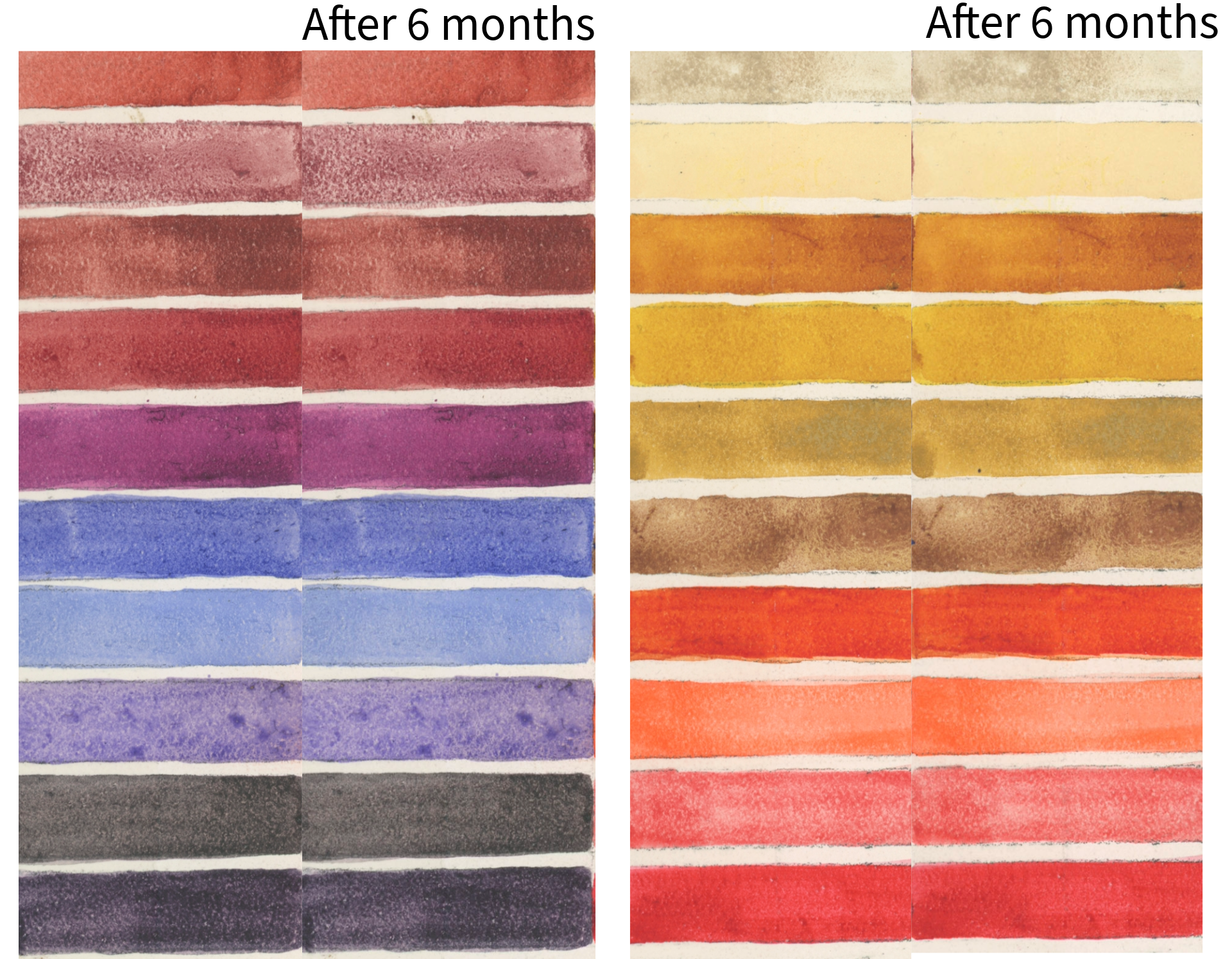
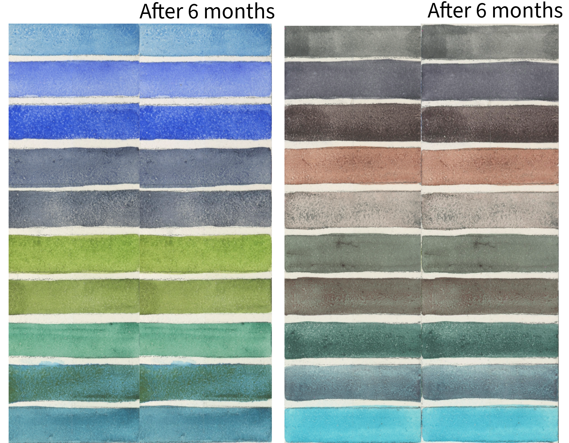
Alongside the Opera Pink experiment, I also included a separate set of swatches using many of the watercolor colors I reach for most often in my own paintings.
The purpose of this test is different from the Opera Pink comparison.
Rather than evaluating a single fugitive pigment, these swatches are intended to help me observe how my everyday palette behaves on Aquabord over time. Because Aquabord is less absorbent than watercolor paper, varnishes and protective coatings interact with its surface differently. I wanted to see how those coatings perform across a broader range of colors that I actually use in my work.
Over time, I'll continue comparing the window-exposed samples with their dark controls, looking for changes such as:
loss of saturation
color shift
uneven fading
surface haze
gloss changes
adhesion or coating failure
This is not intended to be a formal lightfastness ranking of individual pigments. Instead, it's an ongoing studio reference based on the materials I personally paint with, and I'll continue sharing updates as meaningful changes appear.
Colors included in this palette:
Reds & Pinks
Indian Red — Winsor & Newton
Potter's Pink — Schmincke
Garnet Genuine (PrimaTek) — Daniel Smith
Perylene Red — QoR
Perylene Crimson — QoR
Purples & Violets
Rose of Ultramarine — Daniel Smith
Smalt (Dumont's Blue) — Winsor & Newton
Lavender — Holbein
Cobalt Violet — Schmincke
Shadow Violet
Moonglow
Earths & Warm Colors
Buff Titanium — Daniel Smith
Jaune Brilliant — Holbein
Magic Wizard — Rockwell Art Supplies
Quinacridone Gold — Schmincke
Yellow Ochre — M. Graham
Tundra Orange — Schmincke
Transparent Orange — Daniel Smith
Pyrrol Orange — QoR
Rose Doré — Winsor & Newton
Quinacridone Coral — Daniel Smith
Greens & Neutrals
Cerulean Blue — Winsor & Newton
Cobalt Blue — Daniel Smith
French Ultramarine — Daniel Smith
Haze Blue — Schmincke
Sodalite Genuine — Daniel Smith
Serpentine Genuine — Daniel Smith
Coarse Sap Green — QoR
Viridian — M. Graham
Cascade Green — Daniel Smith
Aqua Green — Winsor & Newton
Graphite Gray — Daniel Smith
Neutral Tint — Winsor & Newton
Lapis Brown — Rockwell Art Supplies
Mahogany Brown — Schmincke
Hematite Violet Genuine — Daniel Smith
Perylene Green — Winsor & Newton
Desert Green Schmincke
Cobalt Green Deep — Winsor & Newton
Glacier Green — Schmincke
Cobalt Turquoise — Schmincke
While these are all colors I regularly paint with, I don't expect them to perform equally. Some have excellent lightfastness ratings, while others are known to be less permanent. That's precisely why I'm interested in documenting how they behave over time under the same conditions.