
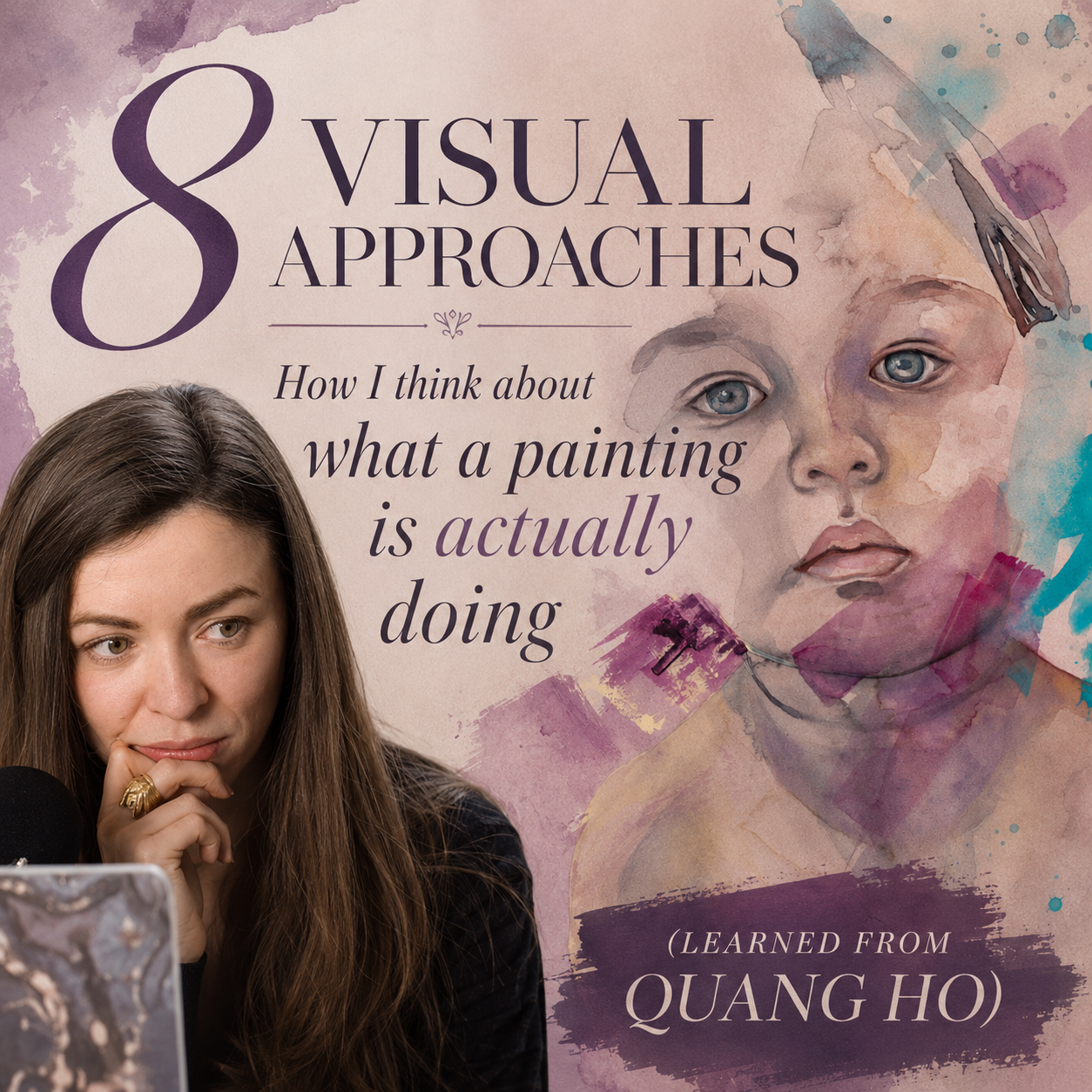
The 8 Visual Approaches: How I Think About What a Painting Is Actually Doing (Learned from Quang Ho)
I've been sitting with a framework for a while now — one I originally encountered through Quang Ho's teaching — and it's changed how I look at paintings, including my own. Not as a formula. More like a set of lenses. A way of asking: what is this painting actually organized around?
The idea is simple, and also kind of uncomfortable once you really sit with it.
Every painting has one system doing the heavy lifting. Not two. Not three. One.
The rest — color, line, edges, pattern — those can all be present. But only one of them is the boss. And if you can't name which one it is before you start, you probably won't be able to hold the painting together once things get complicated.
Here are the 8 approaches as I understand them, mapped to artists whose work I keep returning to.
The Core Idea First
Before I get into the 8, there's one distinction that unlocked everything for me:
Presence is not the same as dominance.
A painting can have color, value, line, and silhouette — all present, all doing something. But only one is carrying the painting. The others support it or accent it. When you mistake "this painting has color" for "this painting is organized around color," you end up with work that hedges. Work that's technically fine but doesn't quite land like you want it to.
The way I test for the boss: if I removed this system entirely, would the painting collapse? That's your primary. Everything else is secondary (supporting, ~20%) or tertiary (accenting, ~10%).
1. Local Tone — Flat / Even Lighting

Harbor-Miwa Gardner
The colour of the thing in neutral, diffuse light. Minimal contrast between light and shadow. The figure reads through hue and shape rather than through modeled form.
Think: a cloudy day. Japanese woodblock prints. Van Gogh's flatter portraits. Monet's series paintings where the light is almost sourceless.
This is actually my home base. My CCG portraits — Zephyr, Harbor, Amulet — are all built on local tone. The atmosphere holds the figure. There's no dramatic shadow structure underneath. What gives them presence is color and edges, not light modeling.

Self-Portrait with Grey Felt Ha Van Gogh
The risk with local tone is that without any anchor it can read as unfinished. What saves it is strong color decision-making and deliberate edge control — which is exactly why it suits the way I work.
2. Light & Shadow — Form Modeling
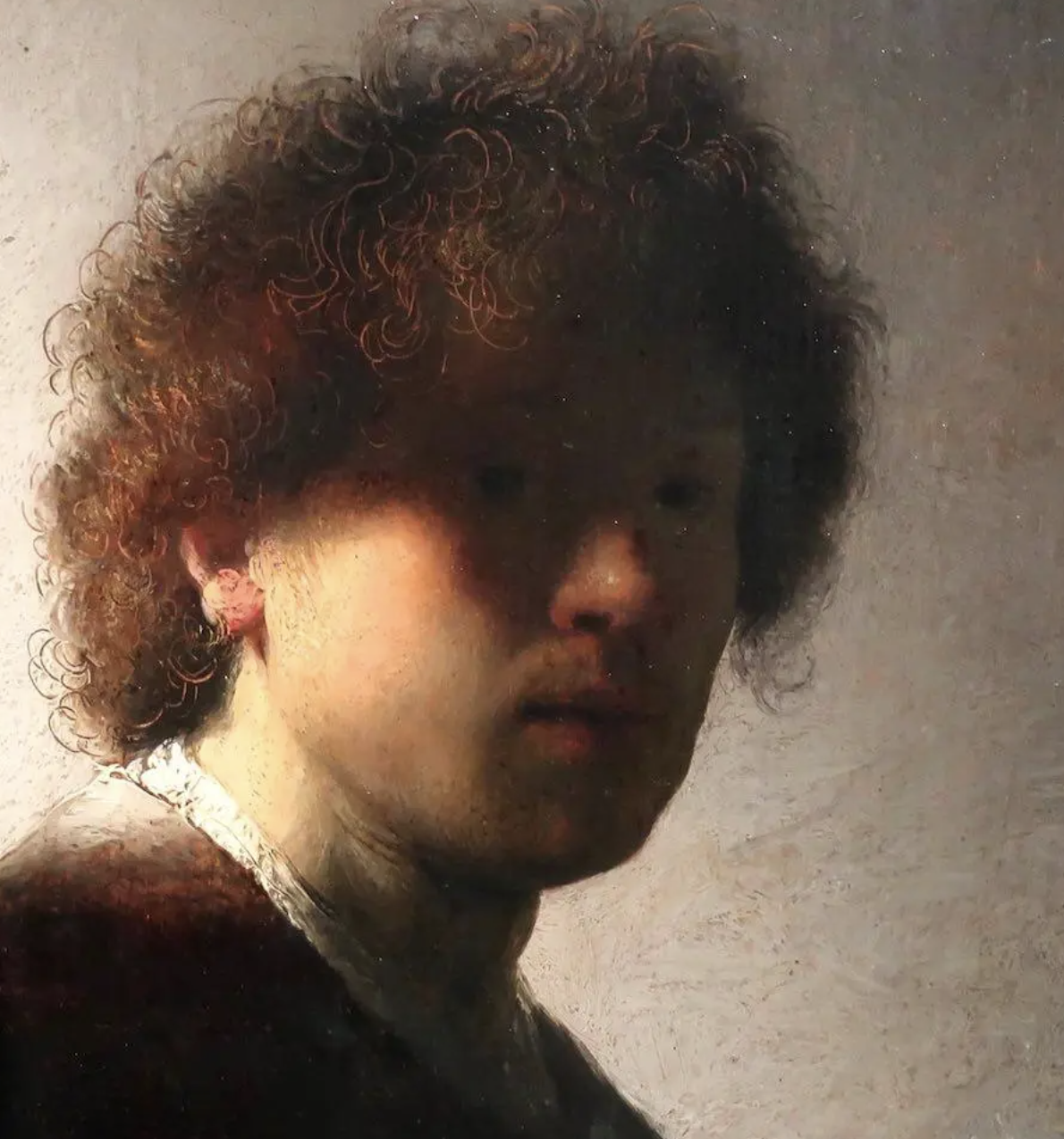
The classic academic approach. Clear division between light side and shadow side. Form is described through the full order of light: highlight → light → halftone → core shadow → reflected light.
Think: Rembrandt. Caravaggio. The foundational realism most of us were taught first.
Jenny Saville is the contemporary painter who uses this most powerfully — and most viscerally. Her figures have mass because value is doing the structural work. The flesh feels like flesh because light and shadow model the volume before anything else happens. Color and texture come after. They intensify what value has already built.
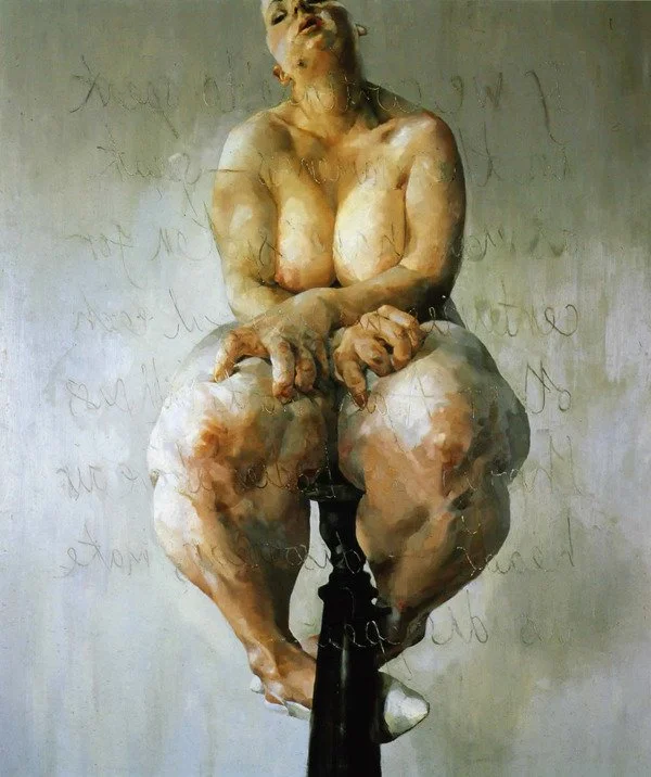
Propped-Jenny Saville
What I take from Saville isn't the impasto or the scale. It's the commitment: the figure has weight before anything else is asked of it. That's the lesson I'm working on — giving a figure enough value structure that there's something to dissolve from.
3. Silhouette — Shape Dominance

Judith-Gustav Klimt
The outer shape does the work. Interior detail is secondary or absent. The figure's identity is carried by its contour.
Think: Klimt's decorative portraits, where the silhouette of the figure is clear and iconic, and the interior becomes pattern. Schiele's raw contour drawings, where the line is so charged it barely needs anything inside it.

In the dream she was floating, not completely submerged-Ali Cavannaugh
And — very specifically — Ali Cavanaugh's Immerse series. Her submerged figures work because the silhouette is designed first. The body shape pushes against the water shape. The negative space is as considered as the figure. That's what creates the suspended, weightless feeling — not softness of technique, but clarity of outer form.
4. Equalization — All-Over / Non-Hierarchy

Garden-Agnes Cecil
No single element completely takes over. Visual weight is distributed across the painting, so the eye moves through the entire surface rather than immediately landing and stopping.
Everything participates.
Agnes Cecile’s Garden is a beautiful example of this. The flowers, washes, and portrait all share importance. The flowers are not simply a background placed behind the figure — they become part of the same visual language. The face appears from the environment instead of sitting separately from it.
The tension comes from the balance:
how much can the surroundings take over while the human presence remains?
This isn’t my primary territory, but it’s something I keep circling around. An equalized environment around a grounded figure creates a strange pull — the subject feels like it belongs to the world around it rather than being placed inside it.
5. Dark–Light Pattern — Value Pattern Design

Arabian I- Christian Hook
The image is built as big value groups. Light shapes and dark shapes drive the composition. Often simplified to two or three values. The painting works in grayscale — which is the test.
This is notan thinking. Not modeling form, but designing with the weight of light and dark as abstract shapes.
Christian Hook uses this underneath everything. His dark, atmospheric grounds aren't just mood — they're structural. The fragmented figures emerge from a declared value pattern. That's why his paintings hold together despite the complexity on the surface. Strip away the fragmentation and the realism and you still have a strong dark-light composition.
6. Color — Colour Relationships Dominant

Lost Flora-Miwa Gardner
Color is the boss.
Not because the painting uses beautiful colors — but because the relationships between colors are what hold the painting together. The structure comes from temperature, harmony, contrast, and the feeling created between hues.
The test: if you removed the color relationship, would the painting lose its reason for existing?

Rouen Cathedral-Claude Monet
Think of Monet’s Rouen Cathedral series. The subject barely changes. The architecture stays almost the same. But each painting becomes an entirely different experience because the color relationship changes. Morning light, evening light, warmth, coolness — color becomes the thing he is actually painting.

Electronica-Christian Hook
Christian Hook approaches color differently. The figure is still present, but unexpected colors interrupt reality. A flash of turquoise, coral, or violet isn't just decoration — it changes how we emotionally experience the figure. Color bends reality.
This is one of my strongest instincts. In Lost Flora, the portrait isn't held together by dramatic lighting or a strong silhouette. The relationship between the pinks, violets, and cooler tones creates the atmosphere. The colors are carrying the memory of the person more than describing the person.
What I’m noticing in my own work: color often isn’t the only thing carrying the painting — but it is the thing that changes the emotional temperature. In Lost Flora, the structure still comes from the presence of the figure and the atmosphere around it, but the pinks, violets, and cooler tones decide how that presence feels.
What I’m exploring now is becoming more intentional about color’s role: knowing when it is the main voice, and when it is the supporting voice that quietly changes everything.
7. Line — Linear Expression

Self Portrait in Orange Jacket-Egon Schiele
Line carries the painting.
Not because it outlines the subject, but because it records the artist’s decisions. A line can hold movement, hesitation, energy, or emotion before color and value ever enter.
The test: if the line disappeared, would the painting lose its voice?

Egon Schiele is one of the clearest examples. His lines are raw, angular, and searching. They don’t simply describe the body — they reveal the tension inside it. The slight distortions, repeated contours, and nervous edges become the emotional structure of the work.
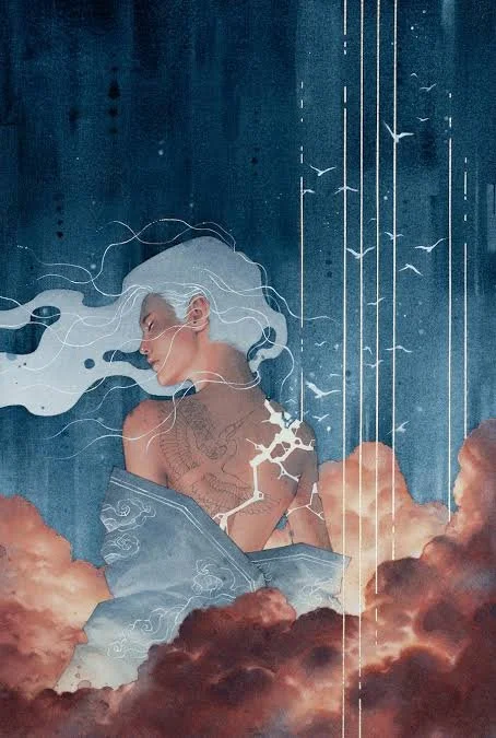
Lucid-Kelogsloops
Hieu Nguyen (Kelogsloops) uses line in almost the opposite way from Schiele. The line is not there to contain the figure — it floats above and through the painting like a memory. It becomes atmosphere, movement, and emotion. The marks remind you that a painting is not only an image of something, but also a record of someone's hand moving across the surface.
This is the side of line I find myself returning to. I’m less interested in using line as a boundary and more interested in line as evidence — the first thought, the searching stage, the part of the process that usually gets hidden.
In watercolor especially, leaving pencil marks, drawing oils, pastel, or charcoal visible can let the viewer see the journey of the painting instead of only the final destination.
8. Line + Shadow — The Finished and the Unfinished Existing Together
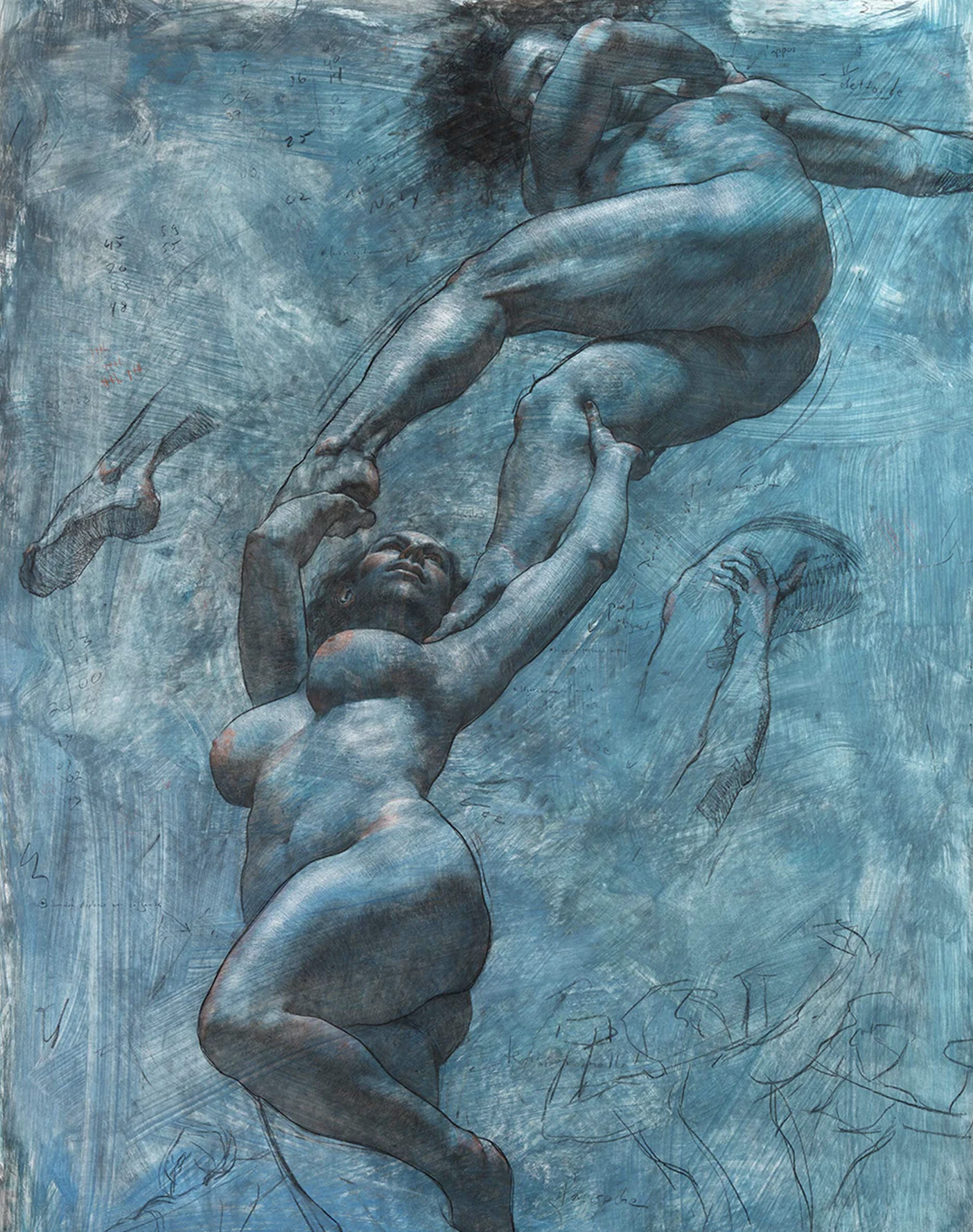
Equinox-Shane Wolf
Line and value share control.
The painting is not carried by contour alone, and it is not carried by light and shadow alone. Instead, two ways of seeing exist at the same time: the observed form and the searching mark.
Shane Wolf is the artist I think about most for this approach.
His figures are deeply constructed — anatomy, volume, light, and shadow give the body weight and presence. But he leaves the drawing alive. The charcoal lines, searching contours, and unfinished marks remain visible instead of being erased.
Shane Wolf — figure study (charcoal/oil mixed media)
The line does not simply outline the figure.
It shows the thinking behind it.
What fascinates me is the contradiction:
the rendered figure says “I exist”
the line says “I am still becoming”
Something finished and unfinished occupy the same surface.
This is the space I keep returning to in my own experiments: leaving pencil lines, drawing oils, or dry media visible over watercolor — allowing the process to remain part of the final painting.
What This Means in Practice
Before I paint, I ask three questions now:
1. What is my boss? Name one of the 8. Write it down. If I can't name it, I haven't decided yet.
2. What supports it? One secondary system. Color leads, edges support. Dark-light pattern leads, local tone supports. Not three equals — one leader and one follower.
3. What am I NOT doing? This one matters as much as the others. Naming the exclusion is a commitment. I am not doing dramatic light and shadow. I am not fragmenting the figure. Then holding that line when the painting starts asking for things.
The Painting I'm Working Toward
After everything — after looking at Saville and Hook and Wolf and Cavanaugh and Schiele for a long time — the territory I keep circling is this:
A figure with enough value structure underneath to have mass. Color that is deliberately pushed away from local tone — not realistic skin, but something that creates emotional distance and closeness at the same time, the way Wolf's blue-violet figures do. One hard edge declared before the painting starts, that everything else dissolves around. A background that has actual shape — that pushes back against the figure the way water pushes against Cavanaugh's submerged bodies. And something left visible on the surface that records the thinking: a pencil line, an unblended wash, maybe a word.
The words I keep coming back to for my own work: ethereal, haunted, nostalgic.
Ethereal needs an anchor or it becomes empty. Haunted is a structural decision, not a mood applied on top. Nostalgia shows you something already gone — it doesn't tell you how to feel about it.
Rawness of visible process inside an ethereal color field. That's the lane. I touched it in a skull study earlier this year and I've been trying to find my way back to it ever since.
Miwa Gardner is a watercolor portraitist based in Seattle. Her practice centers on collaborative portraiture and the intersection of intimacy, memory, and the figure.