
Staining First, Then Liftable: What a Georgia O’Keeffe Study Taught Me About Glow
For this Masters Reimagined portrait of Georgia O’Keeffe, I made a deliberate choice to work against what I had recently learned.
A common watercolor approach is to build with more liftable, non staining pigments first, then add staining pigments later as glazes. Non staining colors tend to sit closer to the surface and can be adjusted. Staining pigments sink deeper into the paper and hold their clarity. That sequence often creates a clean kind of luminosity because light passes through stable layers.
Before learning that structure, I worked the opposite way. I laid staining pigments down first and built more liftable color on top. It felt intuitive at the time. Riskier, but natural.
For this study, I returned to that earlier method.
The underlayer: choosing a mood first
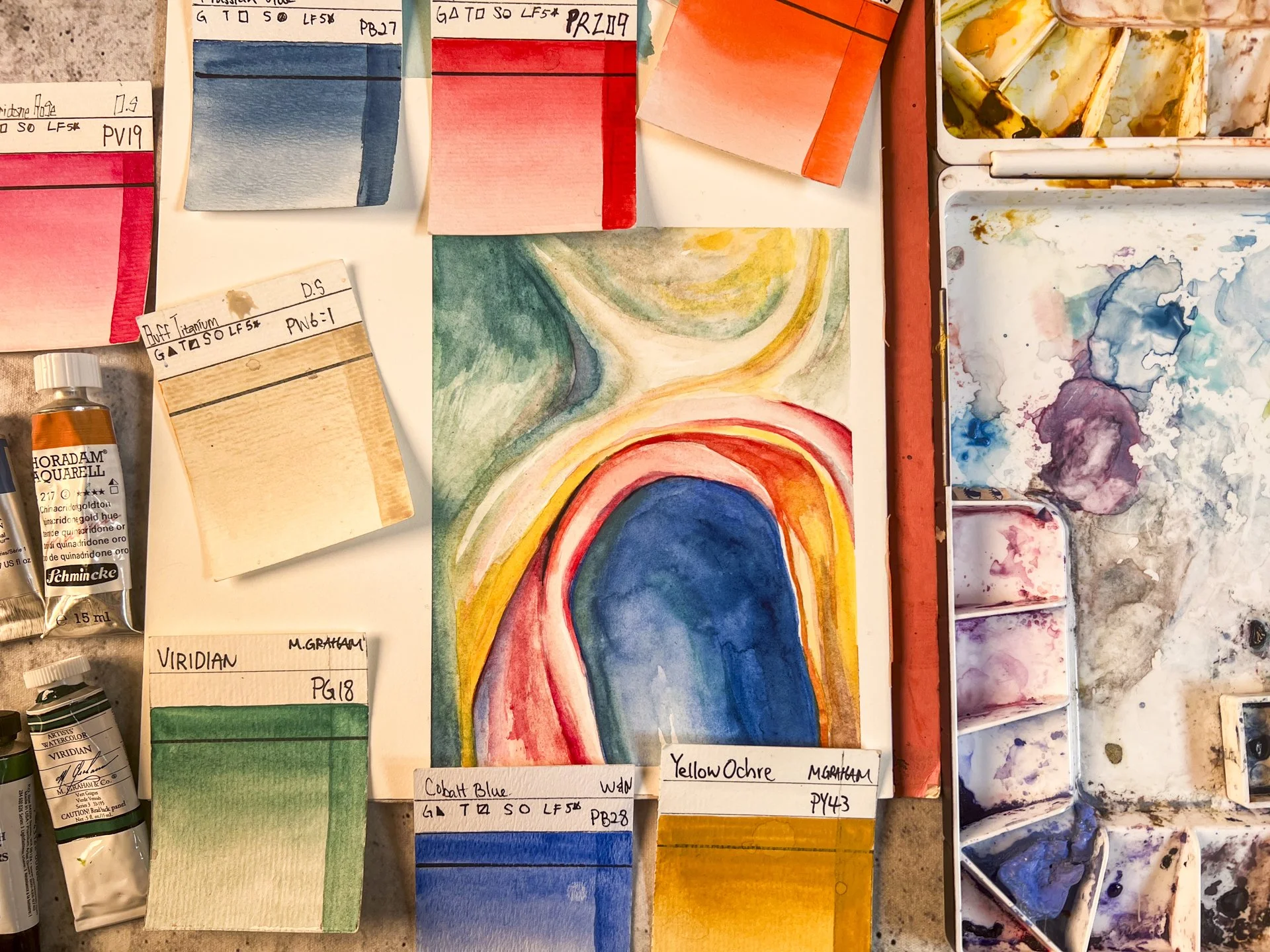
I began with a cool base using Prussian Blue, French Ultramarine, and Indigo. The goal was not brightness. It was tone. Quiet. Interior. Slightly restrained. That emotional temperature felt right for O’Keeffe.
In the second layer, I introduced warmer notes and pushed the portrait structure. This is where the tradeoff showed up clearly.
When granulation creates texture, not glow
I used Tundra Orange over French Ultramarine in parts of the face. Both pigments granulate. Together they made a beautiful texture, but not luminosity. The interaction felt heavier and more atmospheric, like the pigments were talking inside the paint layer instead of letting light travel cleanly through.
That was not a failure. It was information. Sometimes “glow” is not the point. Sometimes I want weight, skin, weather, and quiet pressure.
Drying time matters, even with staining colors
Because I did not give the painting a full day to dry between layers, even the staining pigments shifted slightly when I worked back into them. They did not lift off, but they moved.
That movement softened edges I would have preferred to keep crisp, especially around the hair and the jacket. It reminded me that technical structure supports emotional intention. If I want calm control, I have to build in actual drying time.
The clearest lesson: warm over cool brings life fast
The most revealing moment came when I glazed Quinacridone Coral across the cheeks. Over cool blues, it immediately created life.
Warm over cool does something fundamental in watercolor. The temperature contrast creates clarity without needing opacity. It draws the eye without force.
This was the moment where the “glow” felt real, even inside a reversed layering method.
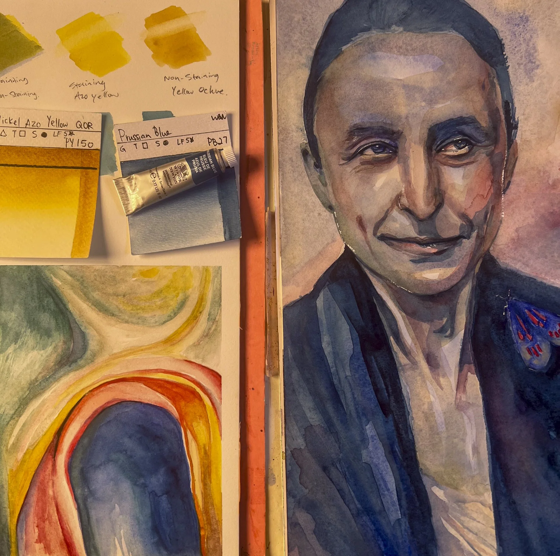
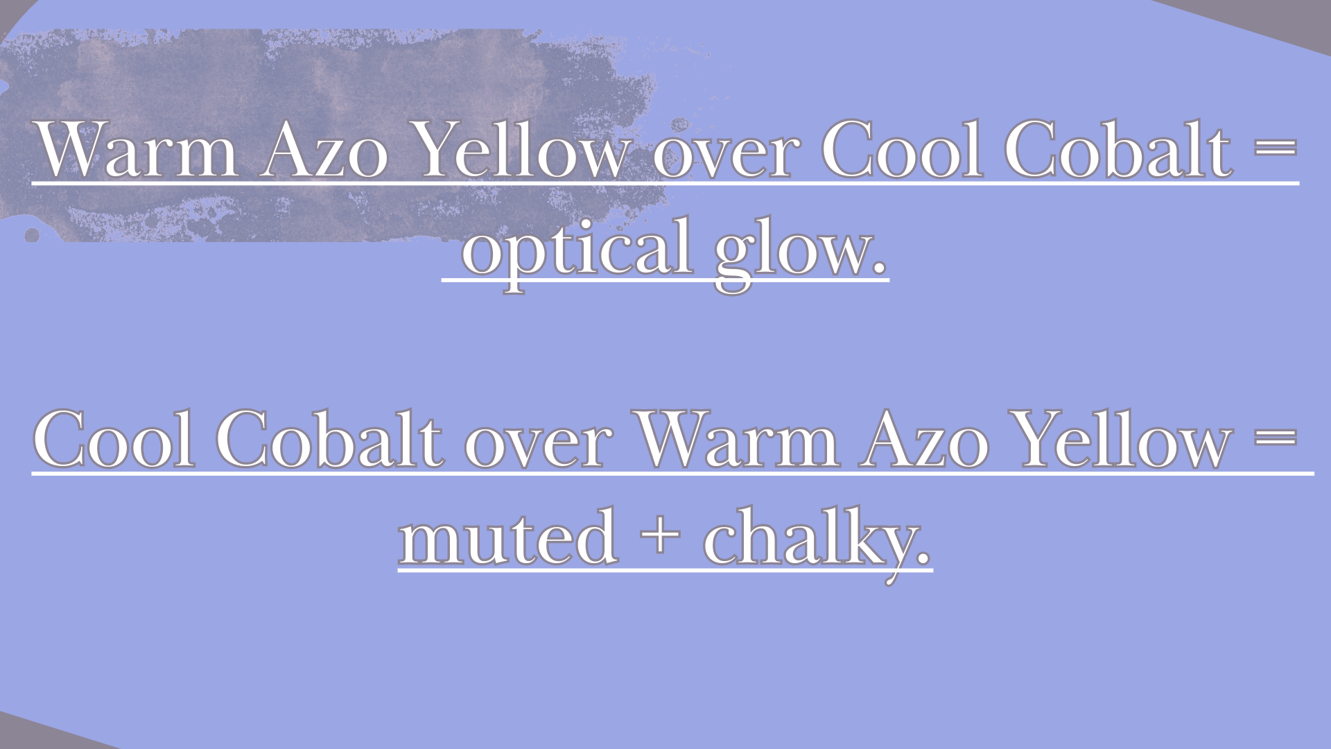
In the video, I also tested a simple pairing: Nickel Azo Yellow and Cobalt Blue, then reversed the order.
When the non staining blue went down first and the staining yellow was glazed over it, the green appeared brighter and cleaner. When the staining yellow went down first and the blue was layered over it, the result felt more muted and a little chalky.
It is not magic. It is placement. Light behaves differently depending on whether pigment is sitting on the surface or sunk into the paper.
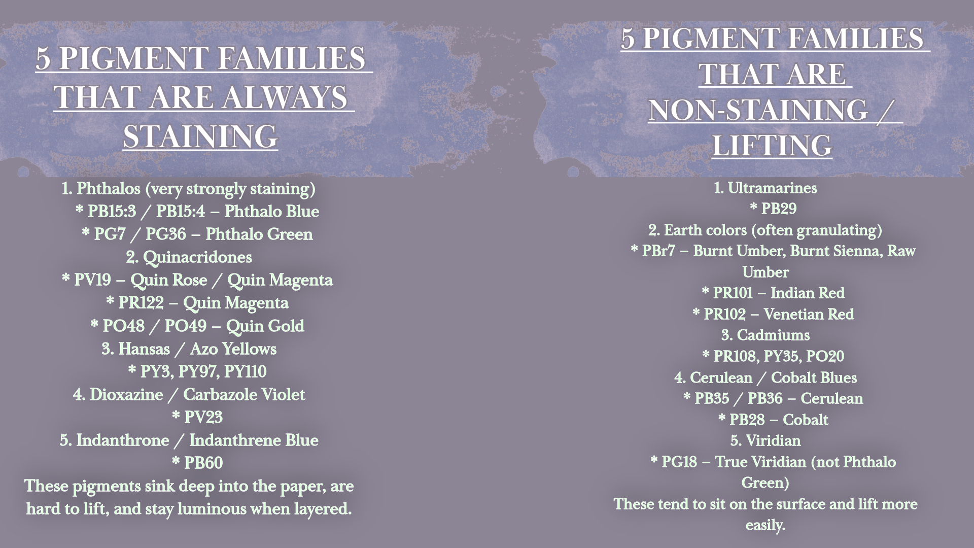
A helpful shortcut is thinking in pigment families. Some families are more likely to stain deeply, and some are more likely to lift. It is not a perfect rule, but it is a practical starting point when you are planning layers.
In general, staining pigments are the ones that commit early. They are harder to lift and they stay vivid when layered.
Liftable pigments tend to give you more room to adjust, and they can look streaky if you overwork them, especially when you are trying to glaze.
What this study changed for me
This study clarified something simple.
Yes, staining over non staining creates a distinct luminous effect. It is technically sound and visually striking.
But luminosity is not always the goal.
Sometimes I am more interested in subtlety, mood, and the quiet conversation between pigments. Reversing the order did not break the painting. It simply changed its voice.
There are real structural differences between these approaches, but there are no rules that cannot be questioned. What matters is whether the method supports the emotional tone you are trying to create.
The full process, pigment tests, and layering experiments are shared in the video.
Materials Used in This Study
All materials are available through Blick:
https://tinyurl.com/2ump7349
Paper and Mediums
Arches Hot Press Block 10×14
https://amzn.to/4kvOeKp
Baohong Hot Press Block 8.3×5.9
https://amzn.to/3YCPvr5
Flashe Vinyl Emulsion White
https://amzn.to/4hh8XAS
QoR Synthetic Ox Gall
https://tinyurl.com/esmppz56
Watercolors
Prussian Blue
https://amzn.to/4819VPI
Quinacridone Coral
https://amzn.to/4jigGih
French Ultramarine
https://amzn.to/4caW2hC
M. Graham Viridian
https://amzn.to/3VvKLBc
Nickel Azo Yellow
https://amzn.to/46DHN2u
Indigo
https://amzn.to/4pFPM73
Buff Titanium
https://amzn.to/4pdyoGW
Book Referenced
Georgia O’Keeffe: To See Takes Time
https://amzn.to/48eguMX
Links above may be affiliate links. Thank you for supporting the studio.
Watch the Full Process
The complete studio process, pigment tests, and layering experiments can be viewed here: